UC Santa Barbara Admissions Packet
The UC Santa Barbara Admissions packet, produced and delivered to new admits in March 2018, was redesigned using the new visual identity, aiming to be more competitive with packets from other universities. Chelsea Boone, Assistant Director of Communications for the Admissions office was the designer and mastermind behind this new approach.
Designed for maximum impact
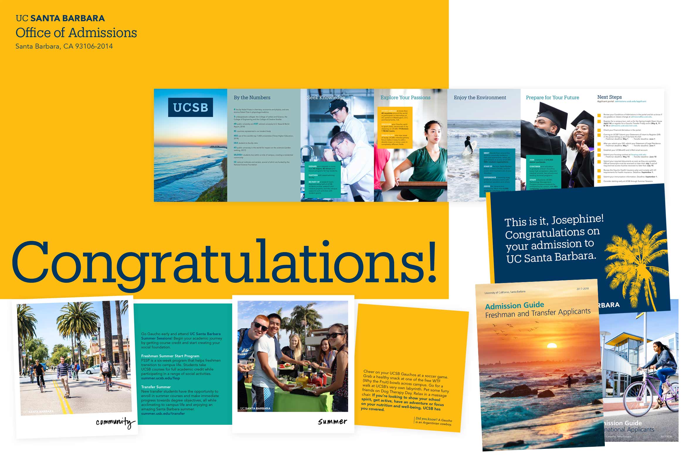
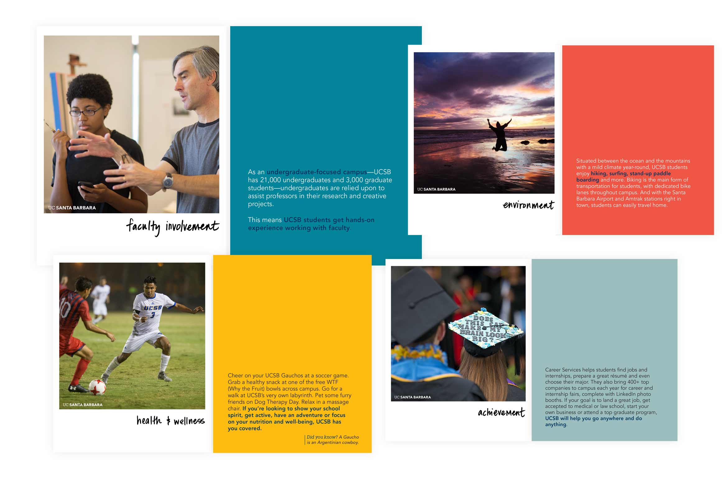
What were you hoping to achieve with this design? I was hoping to produce something fun and a bit surprising. In the past, we sent the traditional admission letter on letterhead with a brochure in a large 8.75x11.5" envelope. This year, I wanted to be more competitive with the packets other universities were sending. The Polaroids were a way to showcase the beauty of the campus while also getting across six key points about UCSB with minimal text.
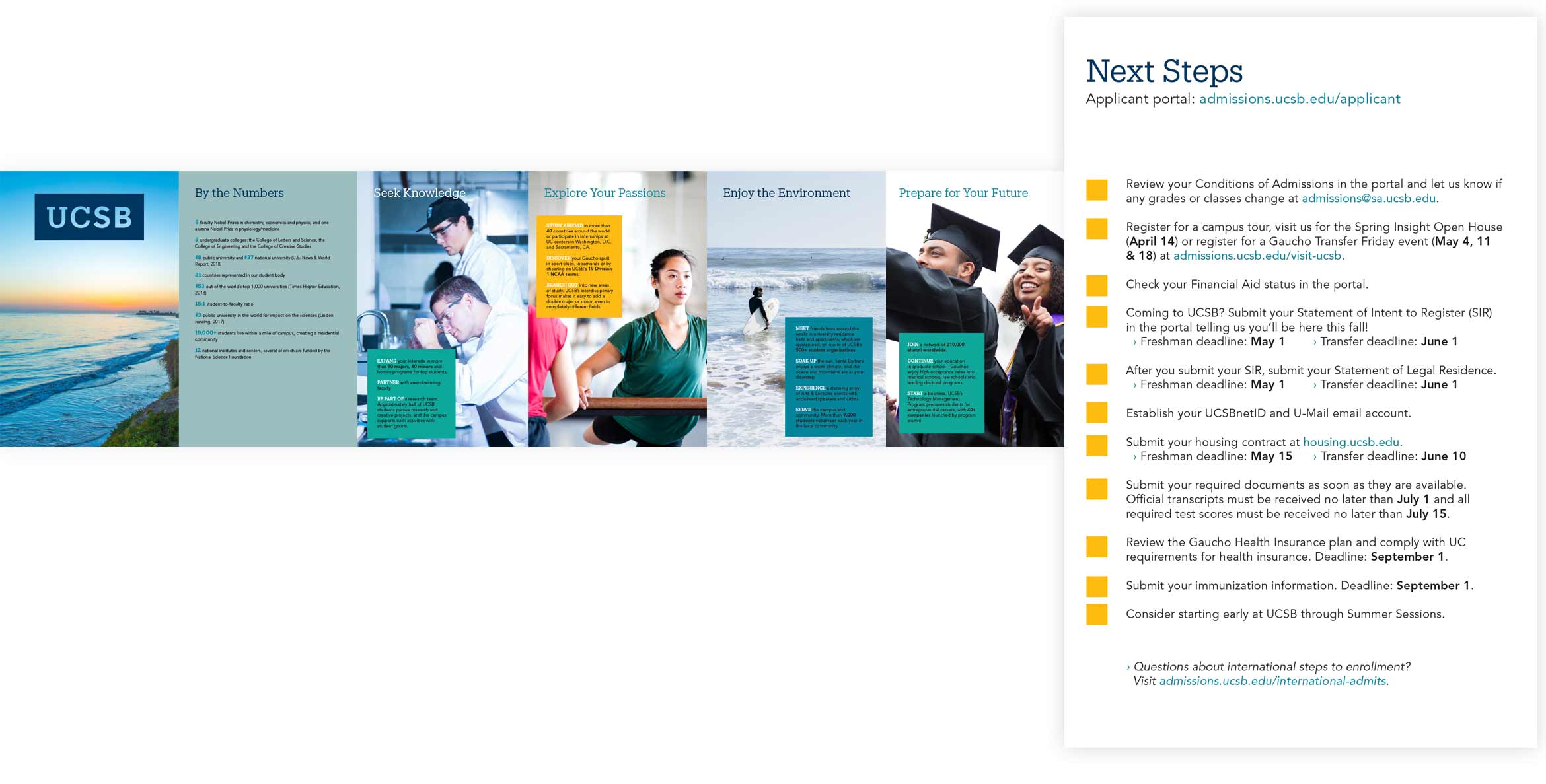
The accordion fold brochure has a perforated seventh panel that students can tear off and keep to check off their next steps.
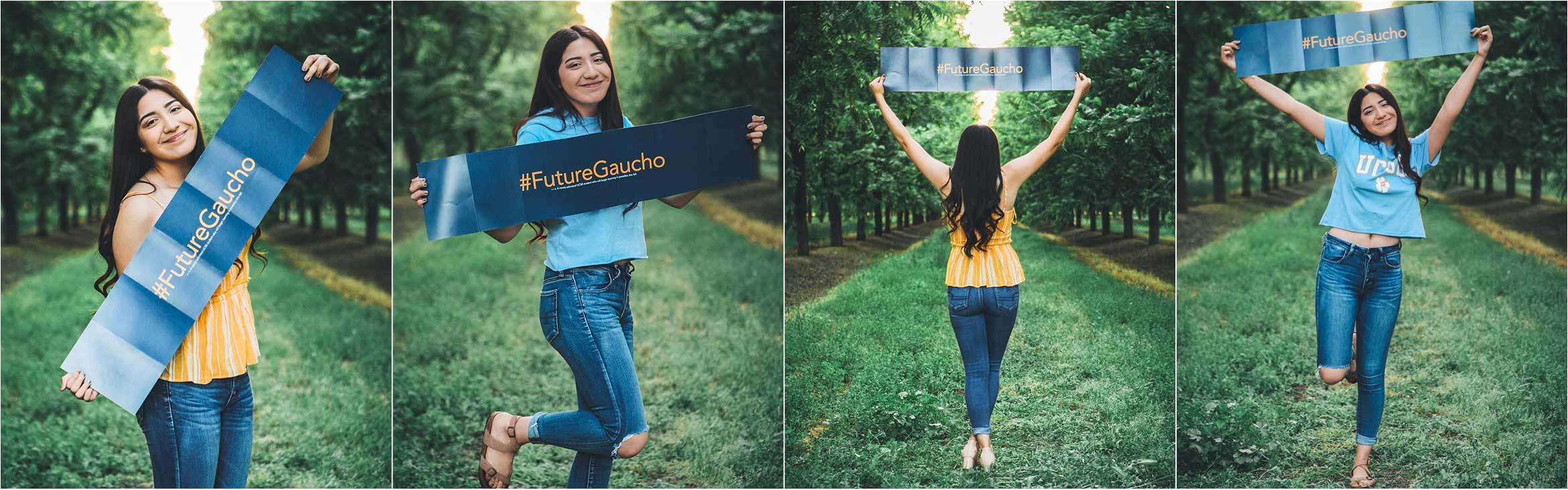
The reverse side of the accordion brochure features a large sharable hashtag design so that students could share their excitement on social media.

What was your experience like working with the new visual identity system? The new visual identity system opened up many new design possibilities. Having the new color palette in particular, instead of just navy and gold, brought a lot more creativity and fun to my materials. The overall look and feel helped me to minimize text, enlarge photos and add more blank space into previously text-heavy pieces.
What is your favorite aspect of the new identity system? I like having a guideline. I can match my brochures against the identity guidelines PDF to see if I'm in line with the look and feel. Before, I think many designers on campus were left to interpret the UCSB brand as they saw fit. I think the new identity system has streamlined that. I love to see it in use across campus so that we are all getting more and more cohesive.
What feedback have you received on the design? We saw a huge increase in social media posting of the packet design on social media compared to previous years. Students posed with the #FutureGaucho flyer at their homes and we also noticed students bringing it to campus to pose by the beach or in front of Storke Tower.
If you have any questions or graciously accepted compliments, send them over to Chelsea Boone.