Typography is an essential part of the UC Santa Barbara visual system. When used consistently, it unifies messaging and creates familiarity. Our full set of guidelines will help you use our typefaces for maximum legibility while reinforcing UC Santa Barbara in the eyes of our audiences.
For information on obtaining desktop licenses for either or both of our typefaces at no cost to your area, please contact us. If you are a Mac user, both Avenir and Produkt are included with macOS Catalina 10.15.7 and onward. For information regarding typeface use on websites please visit our Web Fonts page.
Primary Typeface
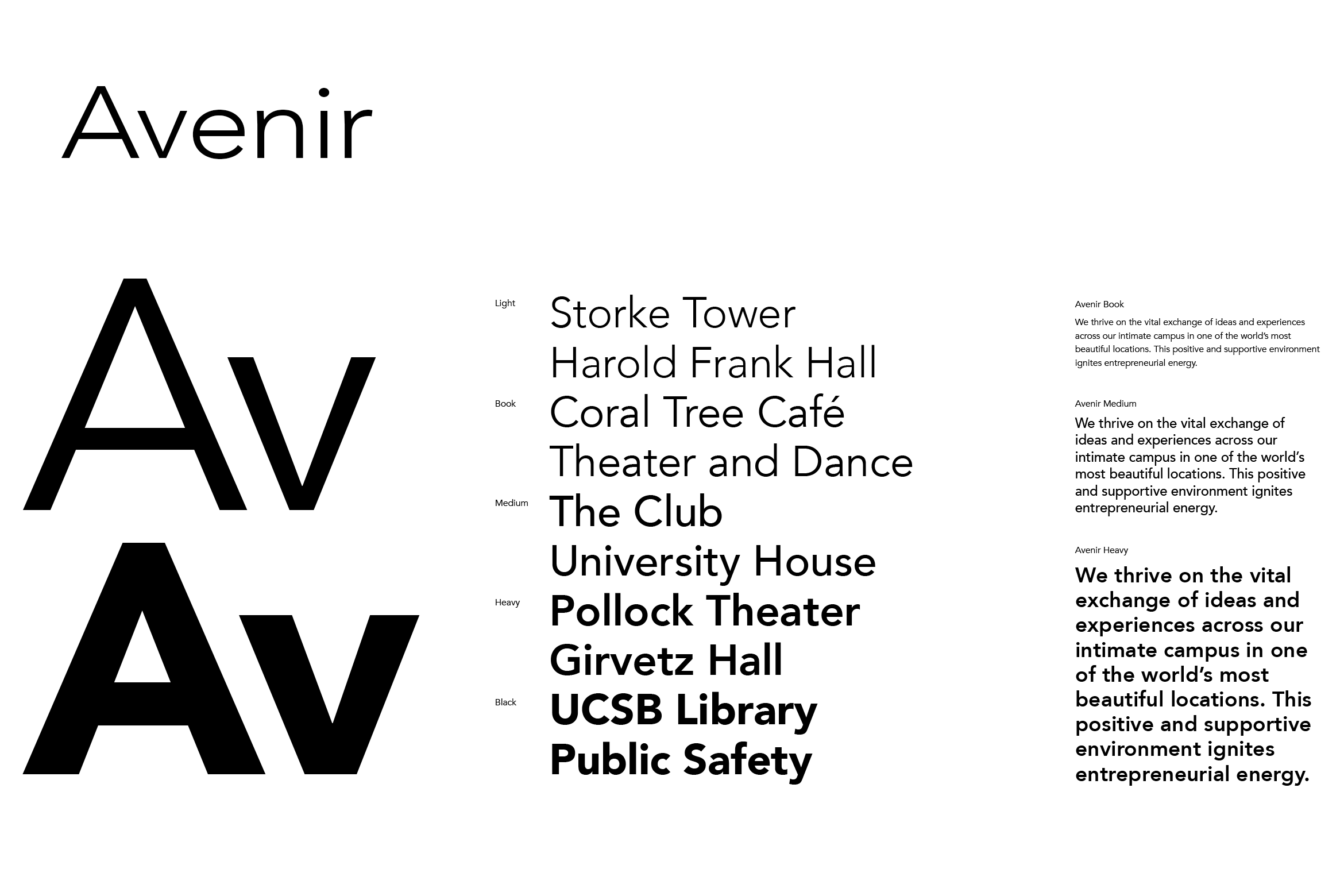
Avenir is our primary typeface. Most UC Santa Barbara communications should use Avenir, including in all body copy and subheads. The typeface is made up of multiple weights: Light, Book, Medium, Heavy, and Black. Italicized versions are also included in the family. The default weight to use is Avenir Light for body copy and Avenir Black for subheads.
The supporting weights of Avenir may also be used, but usually for emphasis in smaller applications such as captions, tables, charts, and folios. In particular cases, Avenir may also be used for headlines when our secondary typeface, Produkt, is not appropriate.
Title and sentence case are preferred. Only use all caps in small instances such as charts, labels, and UI navigation. Type should never be altered by adding outlines, drop shadows, or effects. Always set ® and ™ as superscript.
Secondary Typeface
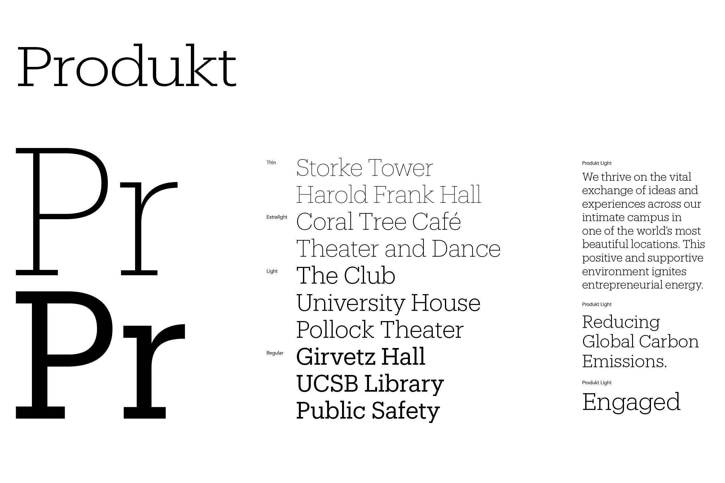
Produkt is our secondary typeface. Produkt, primarily used in large headlines, introduces a subtle warmth that pairs well with Avenir. The typeface is made up of four weights: Thin, Extralight, Light, and Regular. The default weight to use is Produkt Light.
The supporting weights of Produkt may also be used, but usually for emphasis in smaller applications such as captions, tables, charts, and folios.
Title case is preferred. Only use all caps in small instances such as charts, labels, and UI navigation. Type should never be altered by adding outlines, drop shadows, or effects. Always set ® and ™ as superscript.
Type Hierarchy
Three types of copy establish the typographic hierarchy on any page, print or digital: headline, subhead, and body. Avenir, our primary typeface, may be used in all three instances, whereas Produkt, our secondary typeface is reserved primarily for headline copy. Produkt should never be used in body copy. Below are a few examples that outline a basic typographic hierarchy complete with the appropriate typefaces.
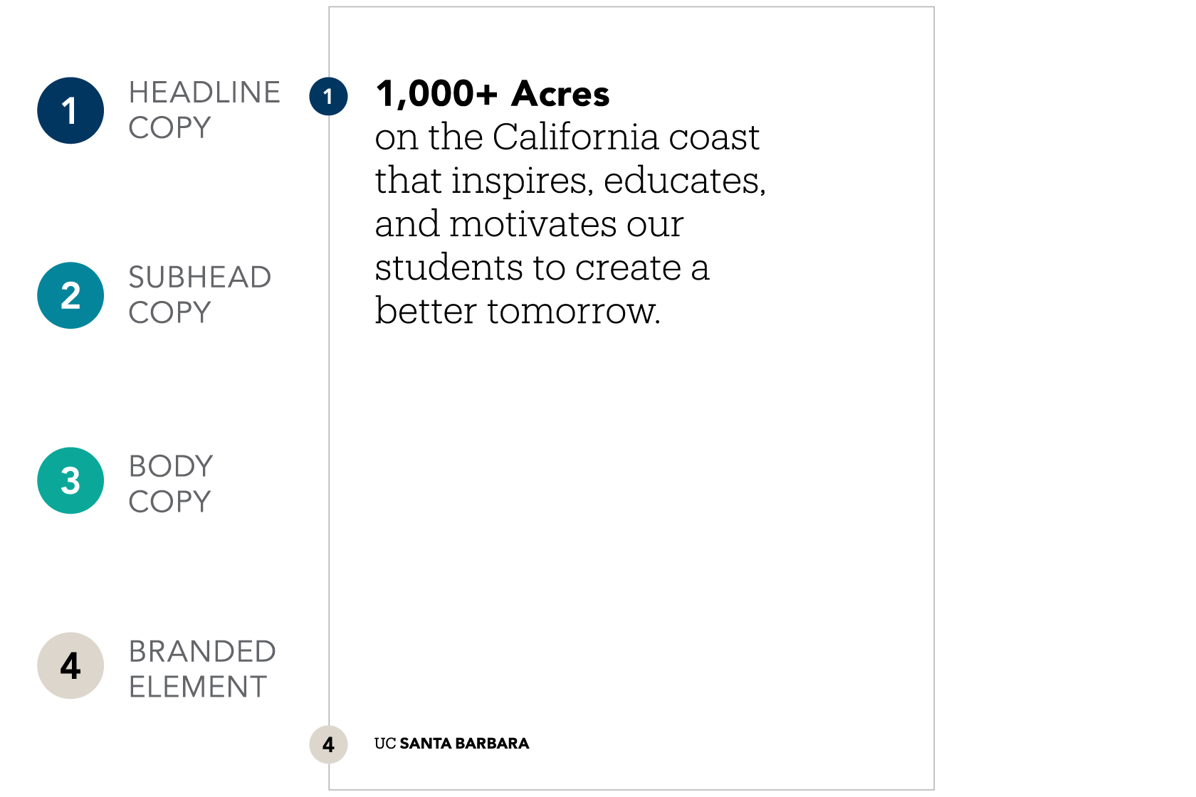
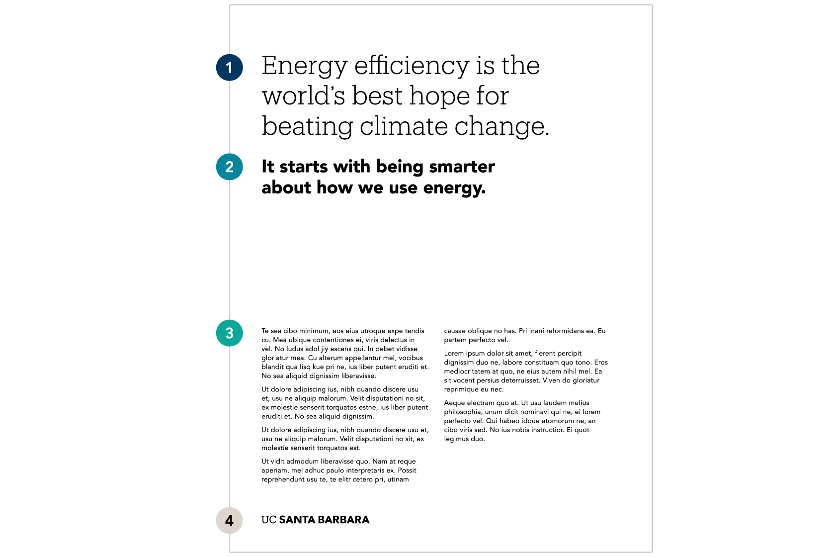
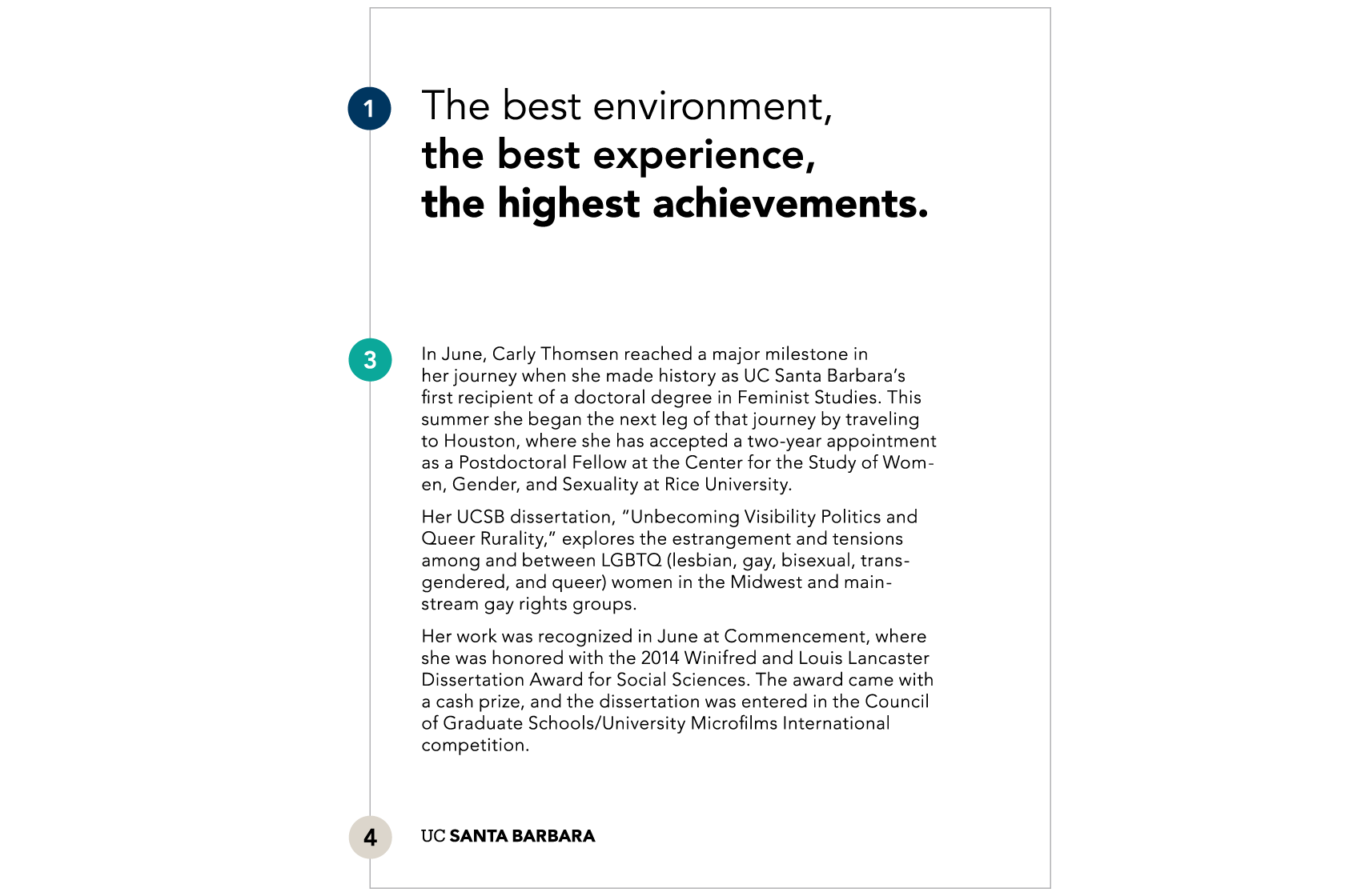
The principles guiding type hierarchy can be applied across all forms of communication. Below are a few examples that show where and how to use our typefaces in accordance with these principles.
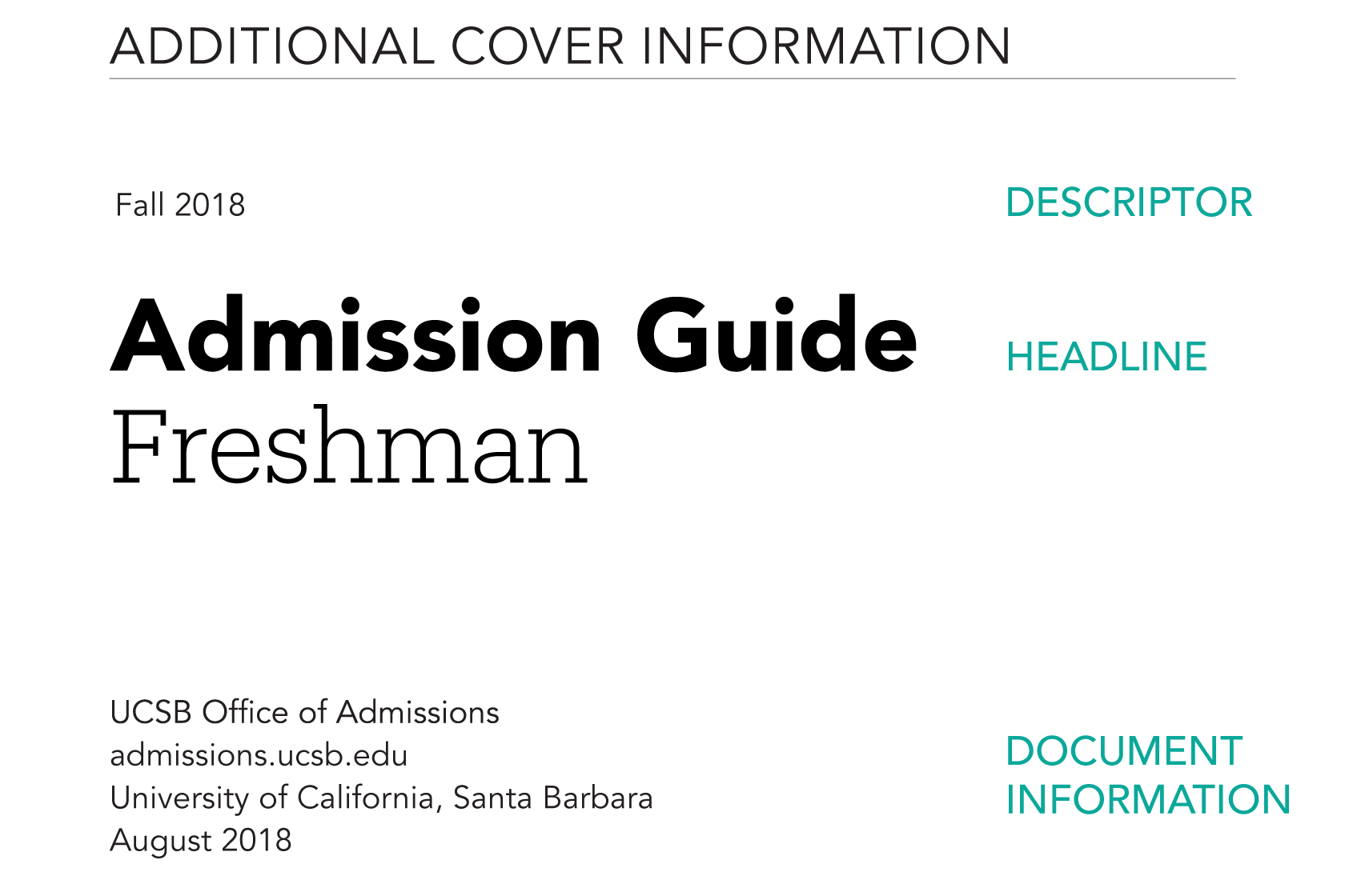
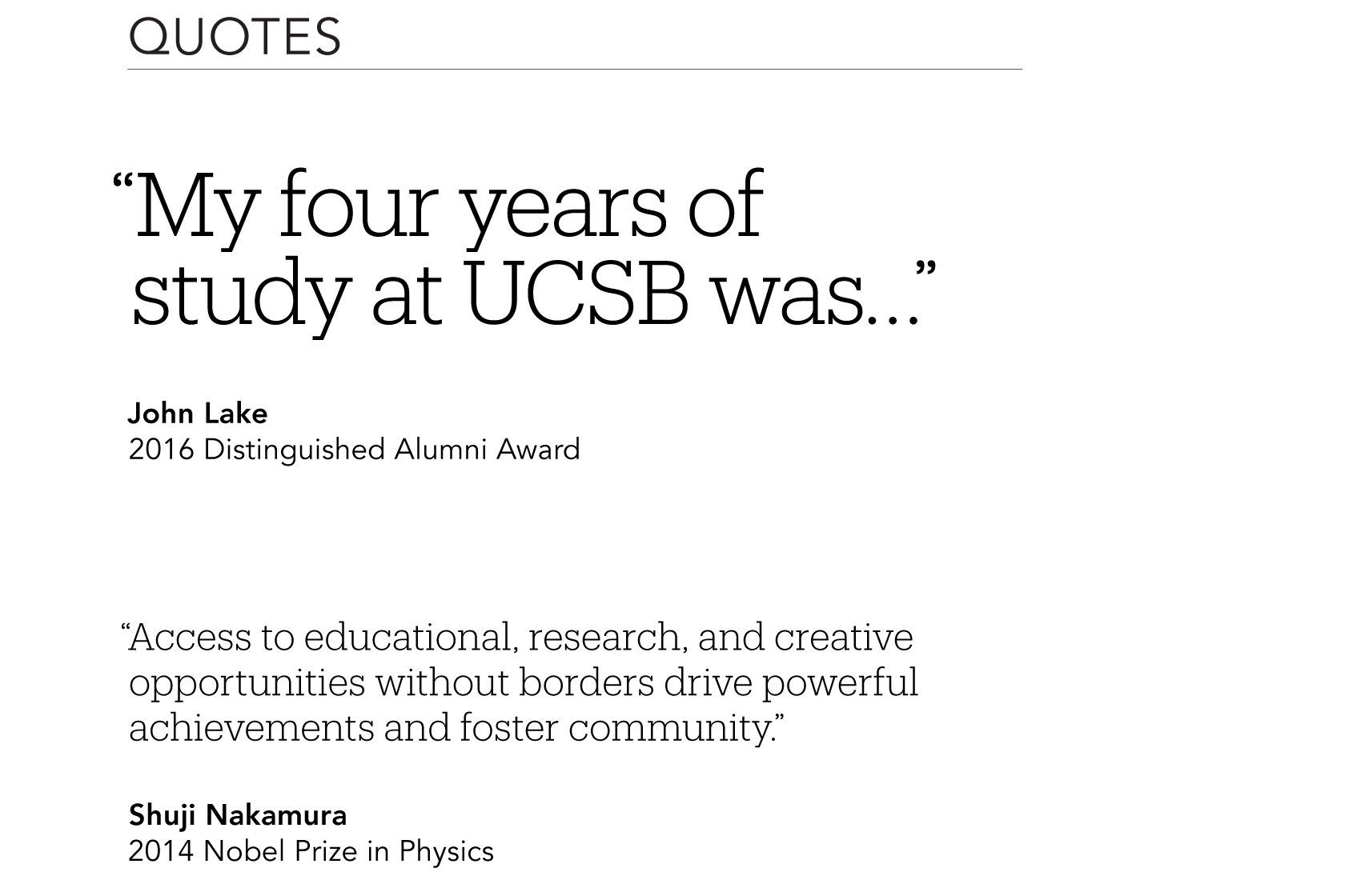
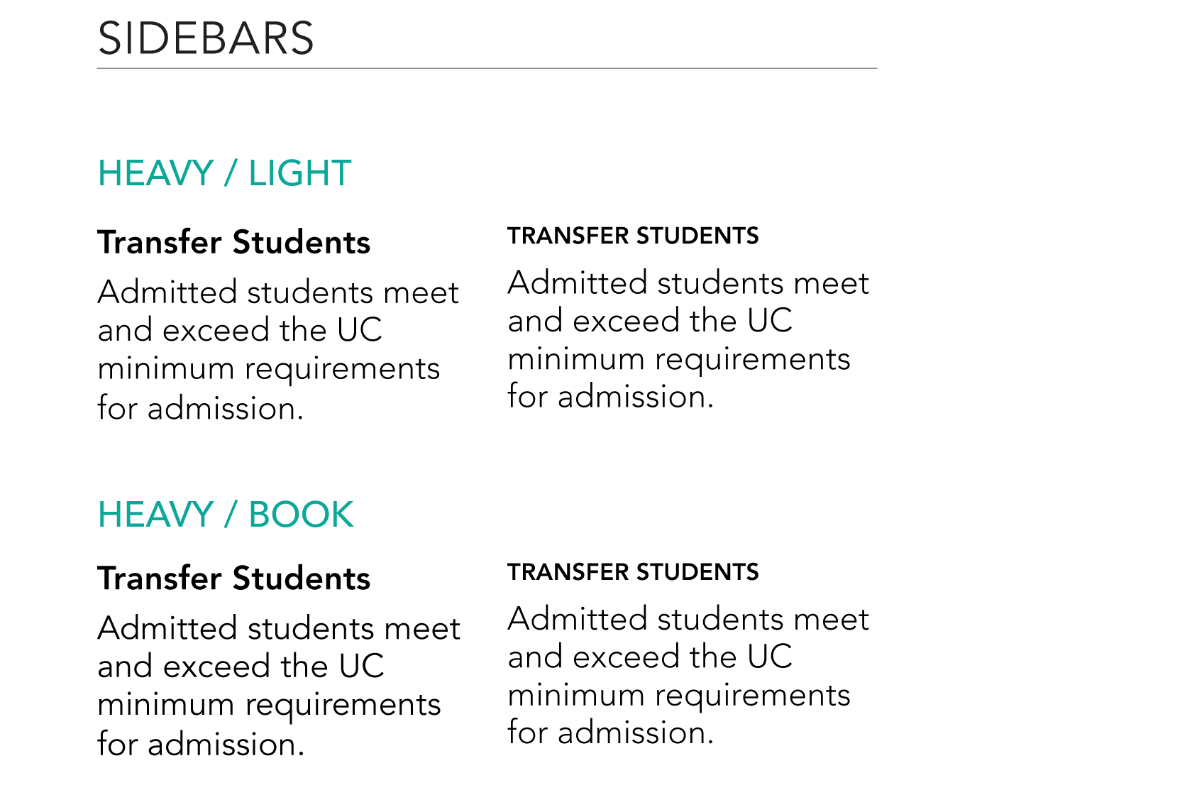
Leading / Tracking
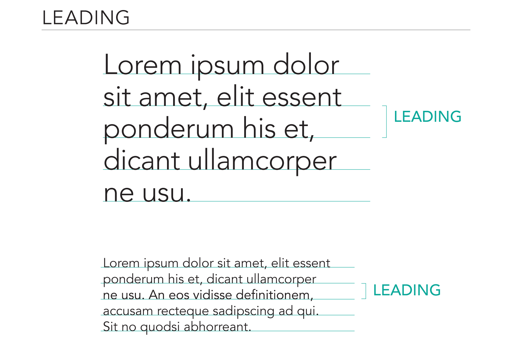
Space between lines of copy and space between letters contribute to elegance and legibility of typography. Leading refers to the space between lines of type. Tracking refers to spacing between characters. Effective application of leading and tracking differs for each typeface and at each type size. The following pages detail recommended best practices for leading and tracking for Avenir and Produkt.
![]()
![]()
Avenir — Size / Leading / Tracking
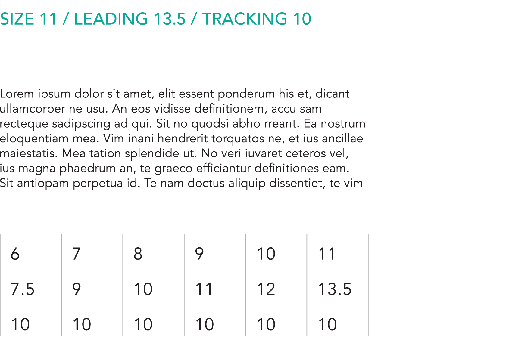
There is a relationship between the point size of the typeface and the leading and tracking. The charts below offer guidance on how to adjust the leading and tracking for Avenir as the point size scales up.
Body
Headlines / Quotes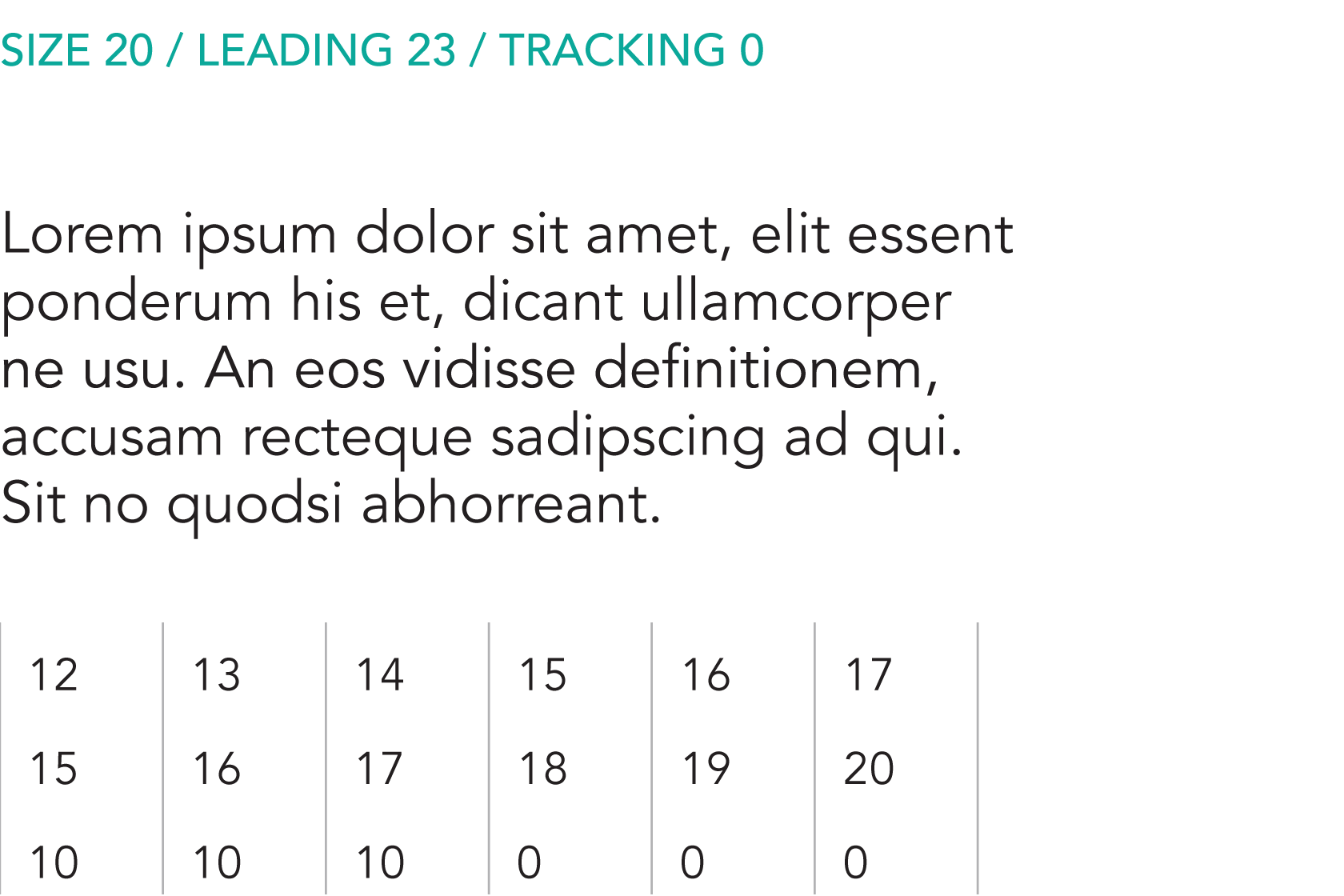
Large Headline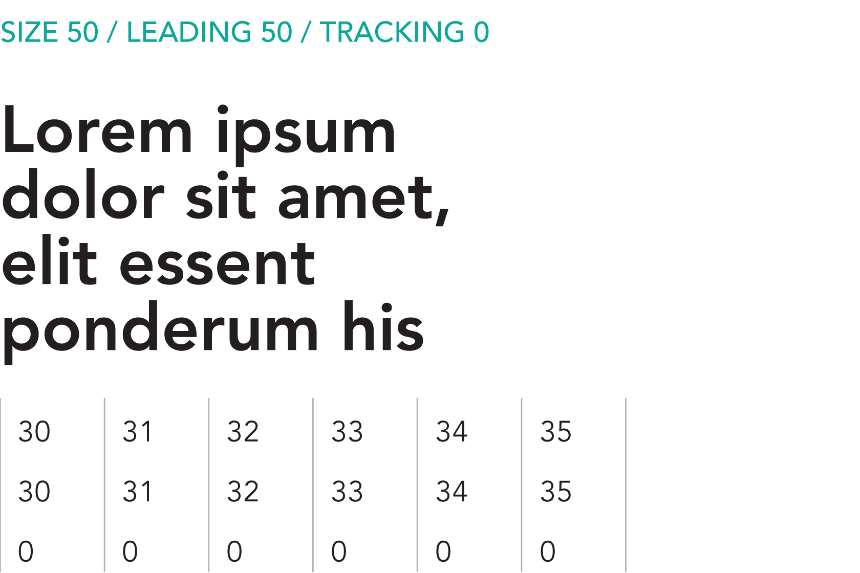
Produkt — Size / Leading / Tracking
There is a relationship between the point size of the typeface and the leading and tracking. The charts below offer guidance on how to adjust the leading and tracking for Produkt as the point size scales up.
Quotes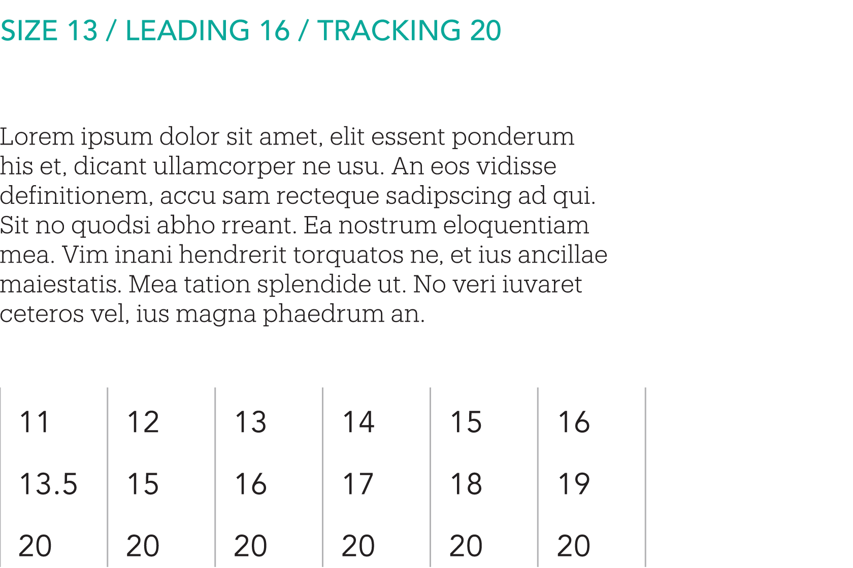
Headlines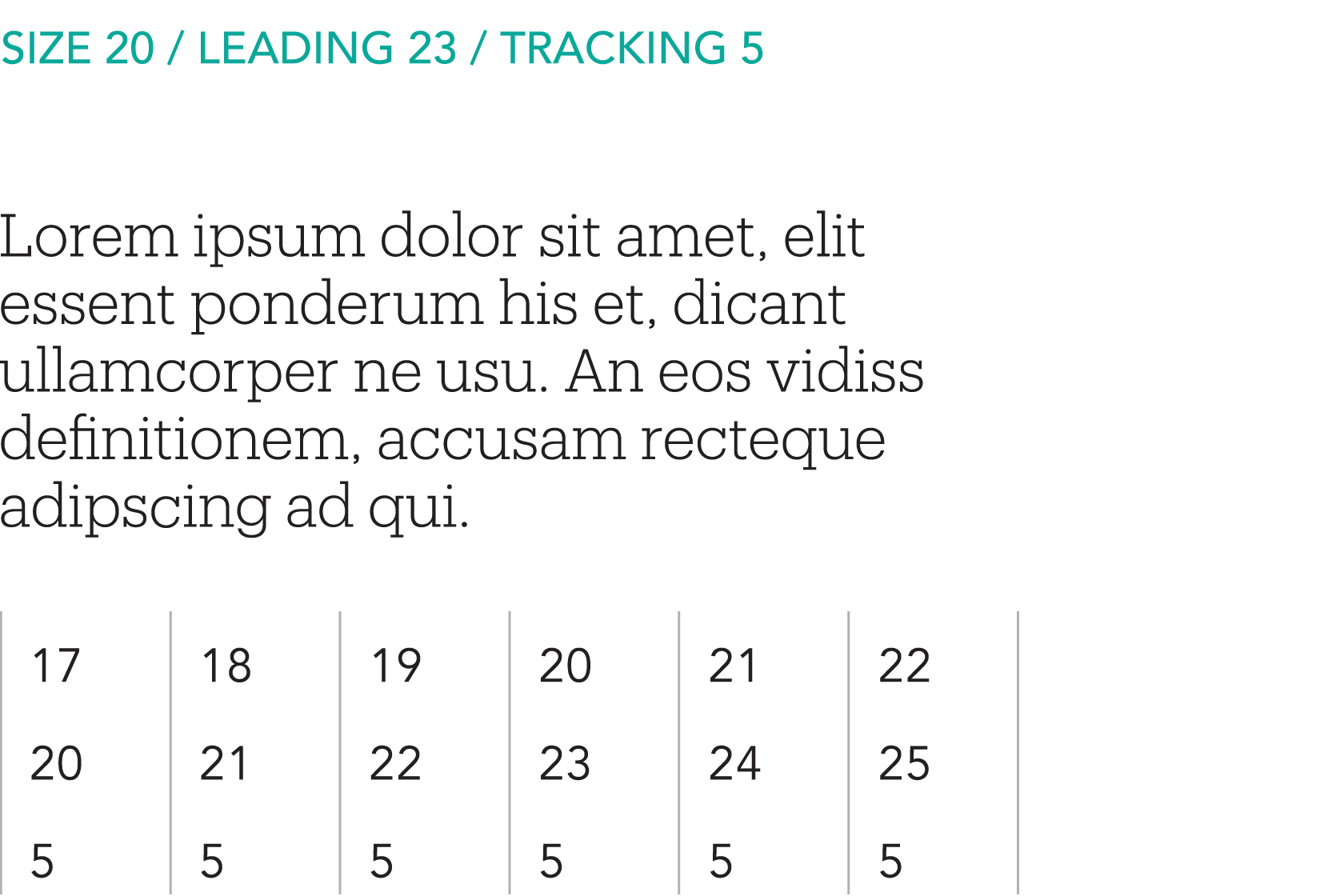
Large Headline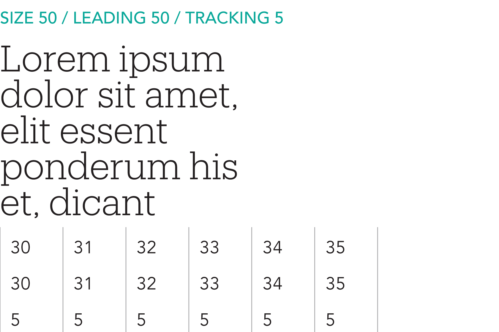
Primary Typeface Substitute
In cases where Avenir and Produkt are not available, Nunito Sans should be used as a substitute. These cases may include digital applications such as Word and Google documents, or digital presentations (such as PowerPoint or Google Slides) that cannot embed fonts.
There are two preferred weights for Nunito Sans, each with an italic version: Regular and Bold. The default weight to use is Nunito Sans Regular for body copy and the Bold weight for headlines. The Black and Light weights of Nunito Sans may also be used for contrast in smaller applications such as subheads captions, tables, charts, and folios as well as very large type.
Nunito Sans
Nu
Nu
Regular
Storke Tower
Harold Frank Hall
Coral Tree Café
Theater and Dance
The Club
Bold
University House
Pollock Theater
Givertz Hall
UCSB Library
Public Safety
We thrive on the vital exchange of ideas and experiences across our intimate campus in one of the world's most beautiful locations. This positive and supportive environment ignites entrepreneurial energy.
We thrive on the vital exchange of ideas and experiences across our intimate campus in one of the world's most beautiful locations. This positive and supportive environment ignites entrepreneurial energy.
We thrive on the vital exchange of ideas and experiences across our intimate campus in one of the world's most beautiful locations. This positive and supportive environment ignites entrepreneurial energy.
Incorrect Usage
The impact of our typography is dependent on proper, consistent use. Any changes to the type hierarchy and associated typefaces will change or diminish the important values, ideas, and meanings with which UC Santa Barbara is associated. Alter them, and they can subtly shift perceptions of the institutions they stand for. For this reason, strict adherence to the correct usage and implementation is critical. Below are some examples of incorrect usage.
Do not set body copy in all caps

Do not apply more than recommended leading

Do not apply extra letter spacing (tracking)
![]()
Do not set copy in Produkt

Do not make headings without contrast

Do not set all body copy in bold

Keep 'em handy
Download the PDF
The guidelines featured on this website represent a subset of the official UC Santa Barbara Identity Guidelines. Download the full set of guidelines for access to additional resources, best practice application examples, and more.