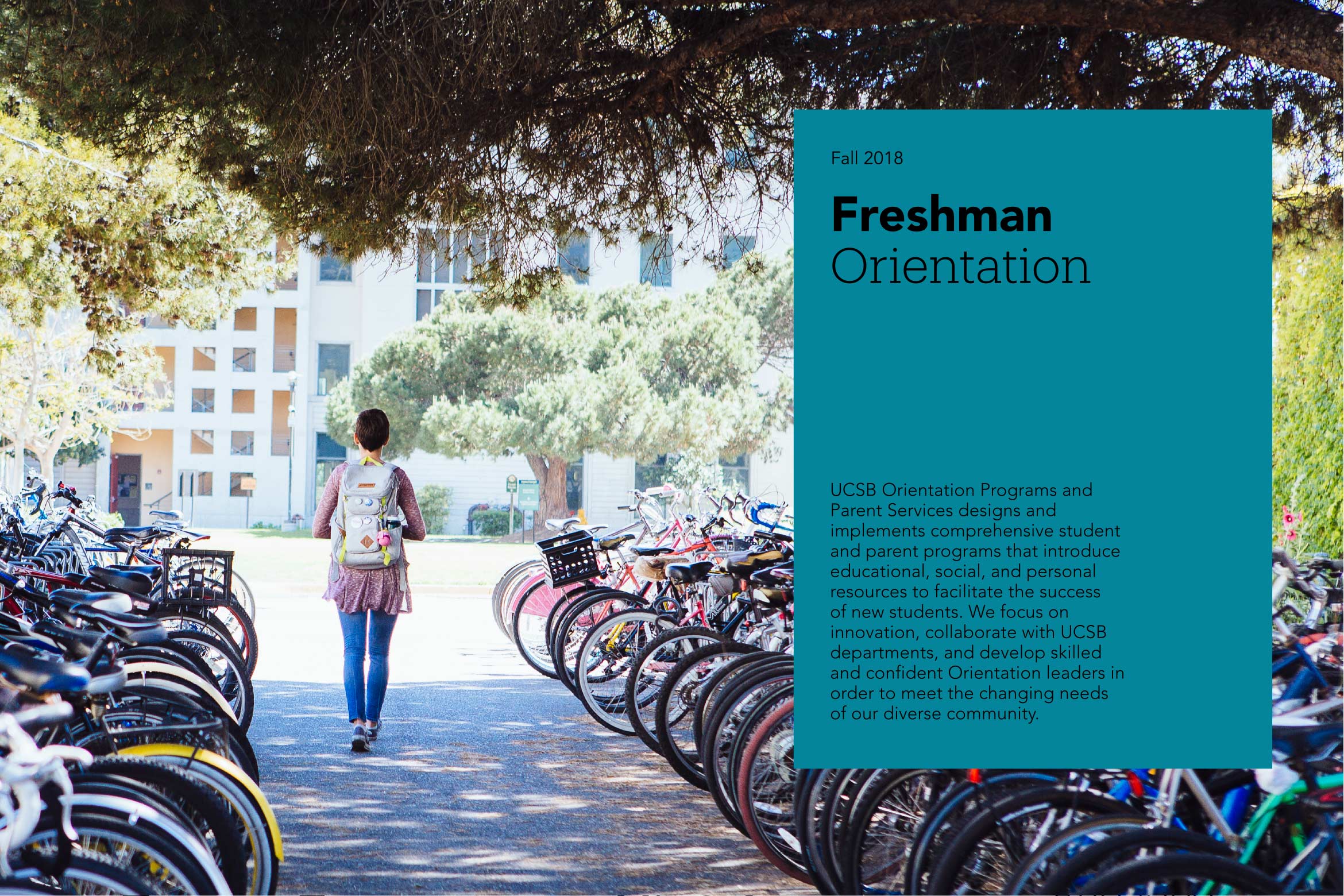
When we pair a strong logo system with a rich palette of color, type, and imagery, we form the basis of the UC Santa Barbara identity system. It was designed to help tell our story in a consistent, compelling way. Adhering to guidelines is essential for presenting the face of our institution with a unified and distinctly UC Santa Barbara voice.
University Marks
Proper use of our university marks facilitates immediate recognition of UC Santa Barbara communications.
Color
Color is a critical element of UC Santa Barbara's graphic identity. It can help to reinforce your connection to the university.
Typography
Typography matters. It's a way to reinforce personality & tone, and to drive cohesiveness across communications.
Photography
A picture is worth a thousand words, especially on a campus as beautiful and vibrant as UC Santa Barbara.
Keep 'em handy
Download the PDF
The guidelines featured on this website represent a subset of the official UC Santa Barbara Identity Guidelines. Download the full set of guidelines for access to additional resources, best practice application examples, and more.


