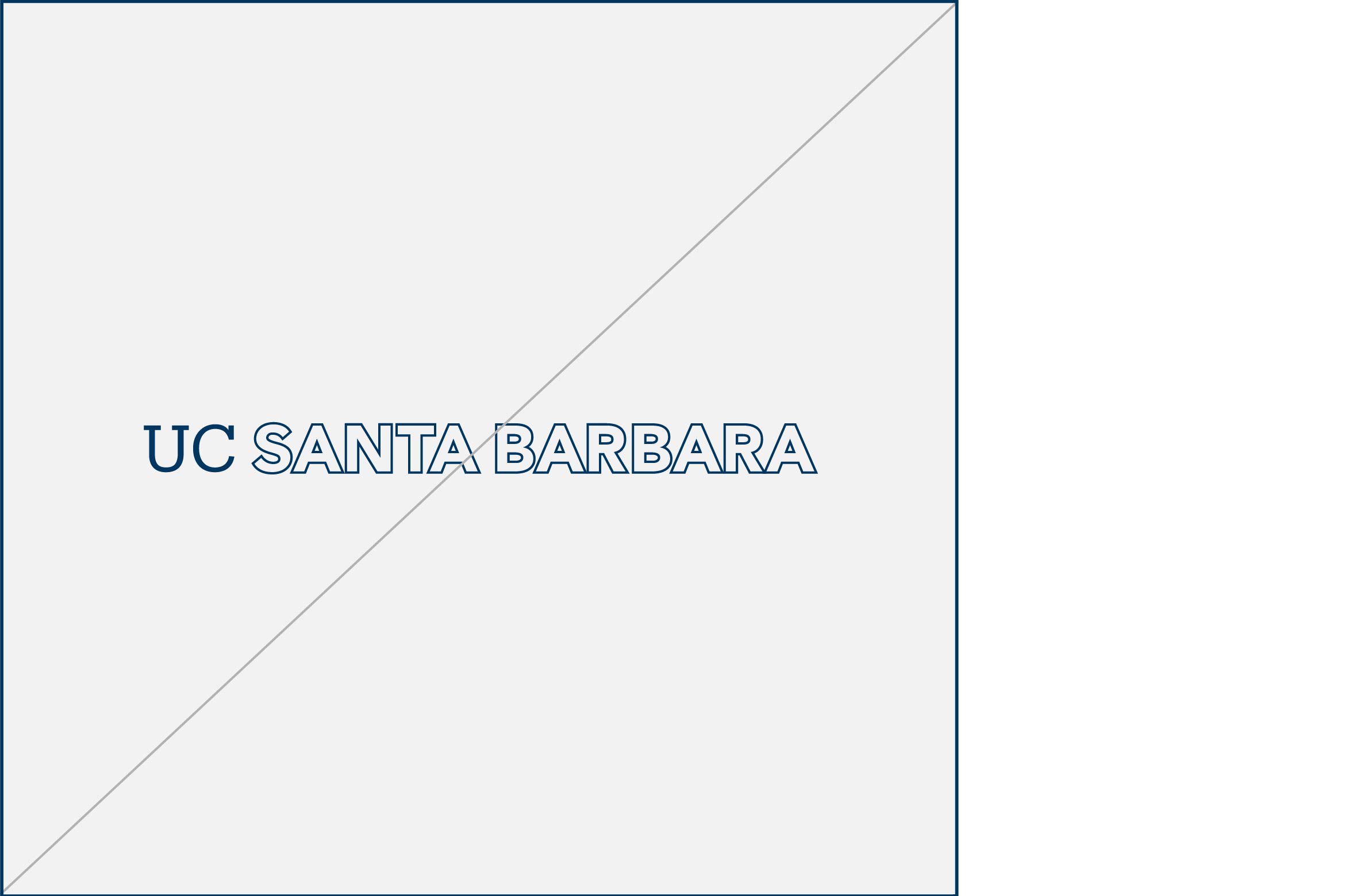
The UC Santa Barbara wordmark is the primary mark and should be used on applications intended for broader external or internal audiences when formally communicating the full name and destination “Santa Barbara” is important. A similar consideration should be taken in written text: At first mention, always use UC Santa Barbara followed by UCSB.
Color Versions, Backgrounds

Navy is the preferred color for the primary wordmark. When using the navy wordmark, white is the preferred background color. As a general rule, avoid placing the navy wordmark on colored backgrounds. Where applicable, the navy wordmark may be placed on our core gold color.

The black version of the wordmark is available for black and white or grayscale designs. When using the black version, white is the preferred background color. Avoid placing this version on colored backgrounds to ensure adequate contrast and legibility.

Use the reversed (white) version when placing the wordmark over navy, dark, or image backgrounds. Be sure there is adequate contrast between the wordmark and the background to ensure legibility.
Clear Space, Minimum Size, Relative Size and Placement
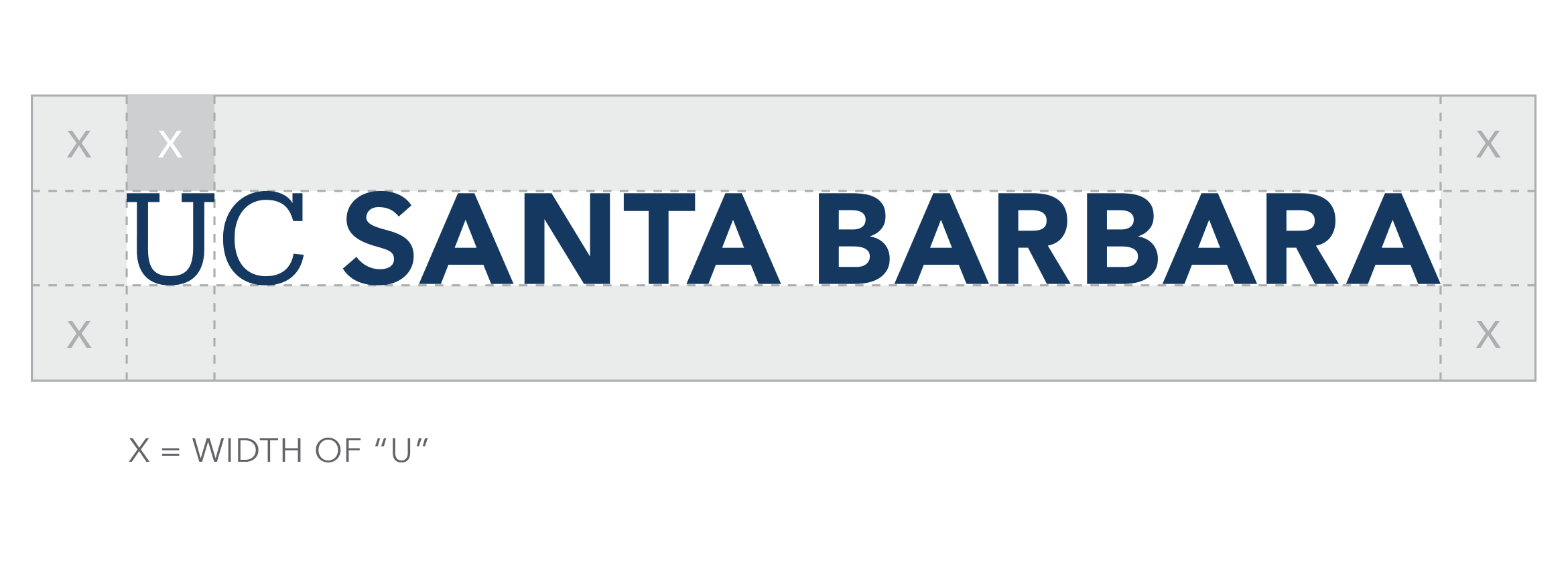
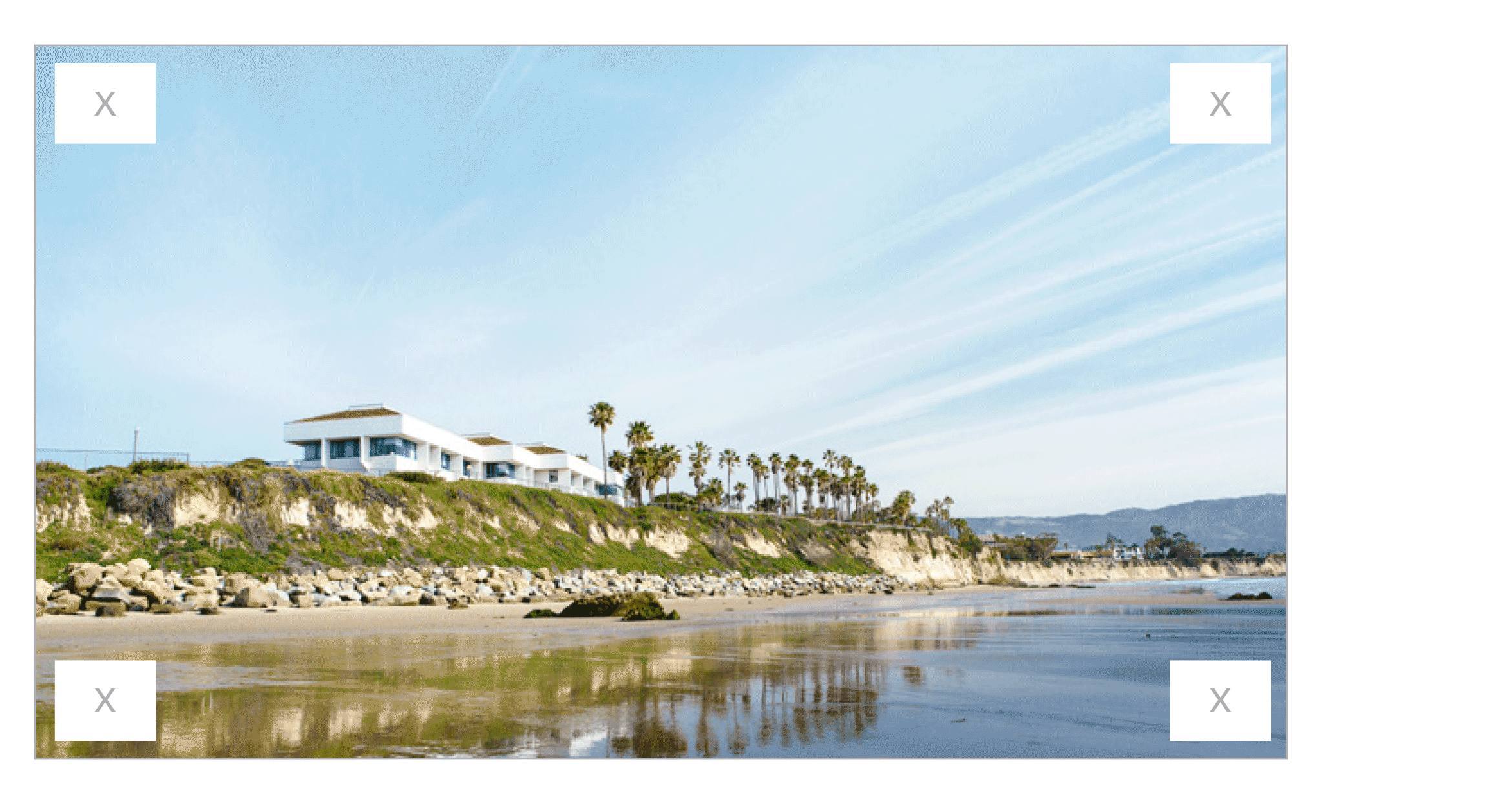
Clear Space
Providing the right amount of clear space around the primary wordmark makes it easier to distinguish and reinforces the importance of the UC Santa Barbara identity. The required amount of clear space to ensure maximum visibility and legibility is determined by the width of the “U” in UC.
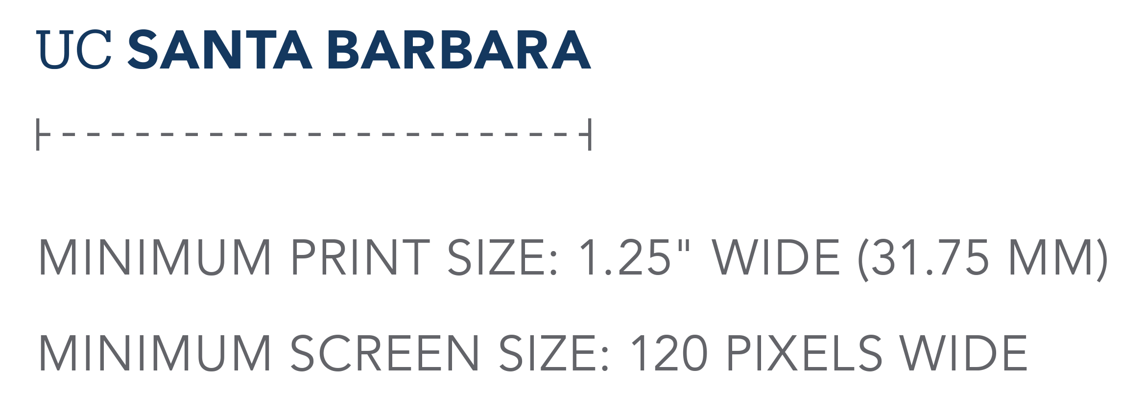
Minimum Size
The primary wordmark is optimized for all applications. It is designed to scale and function at small sizes for print and digital and large sizes for outdoor environments. To ensure legibility and reproduction, adhere to the minimum sizing requirements outlined below.
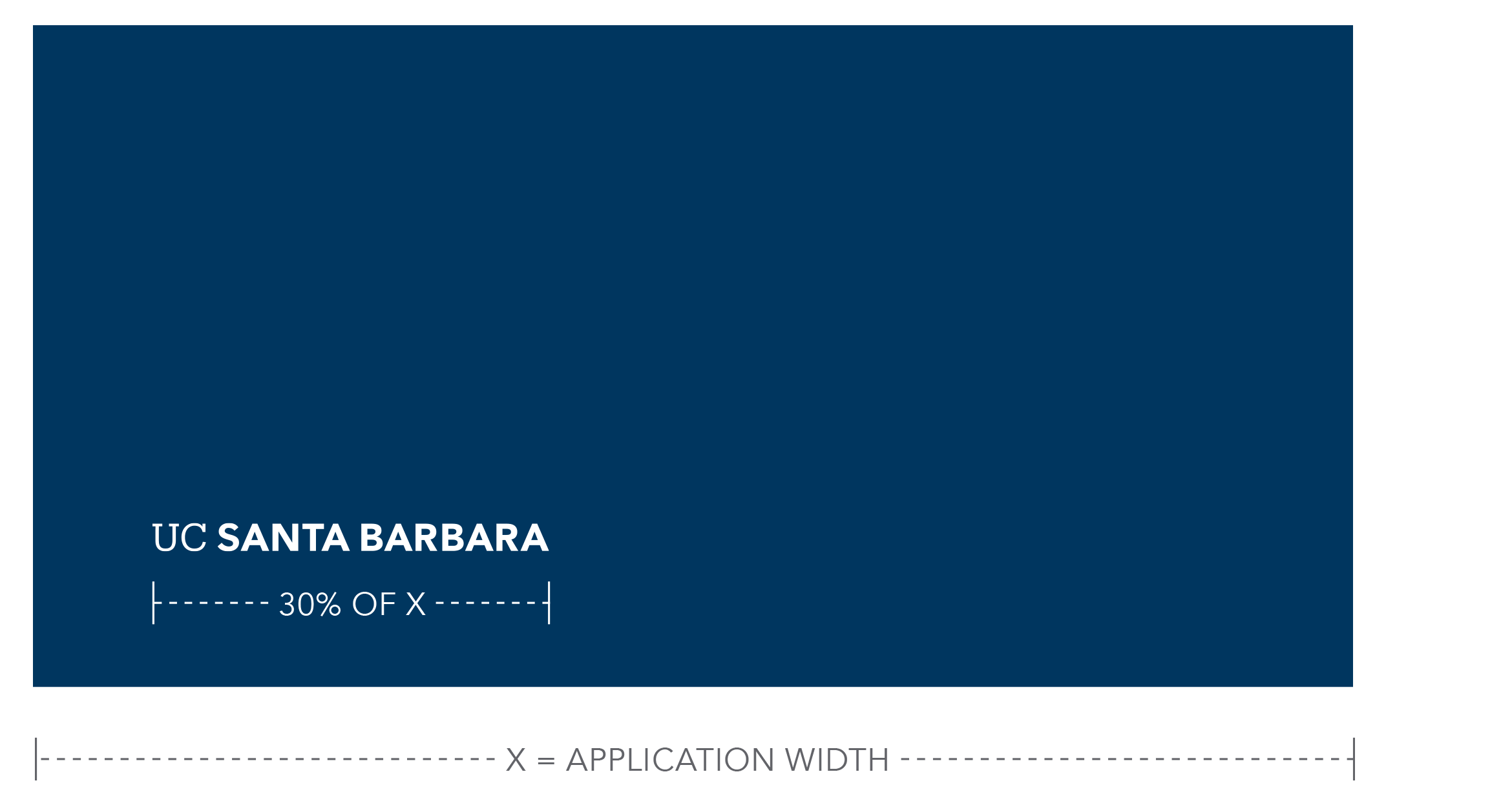
Relative Size and Placement
The size and location of the primary wordmark in layouts is important for recognition, especially when seen multiple times across various touchpoints. A consistent approach to logo placement helps create stronger recognition over time. The exhibits below show relative sizing standards and preferred placement.
Incorrect Usage
The impact of our logo is dependent on proper, consistent use. Any changes to the shape and color of the UC Santa Barbara primary wordmark will change or diminish the important values, ideas, and meanings with which it is associated. Logos are, among other things, symbols of reputation — alter them, and they can subtly shift perceptions of the institutions they stand for. For this reason, strict adherence to the correct usage and implementation is critical. Below are some examples of incorrect usage.
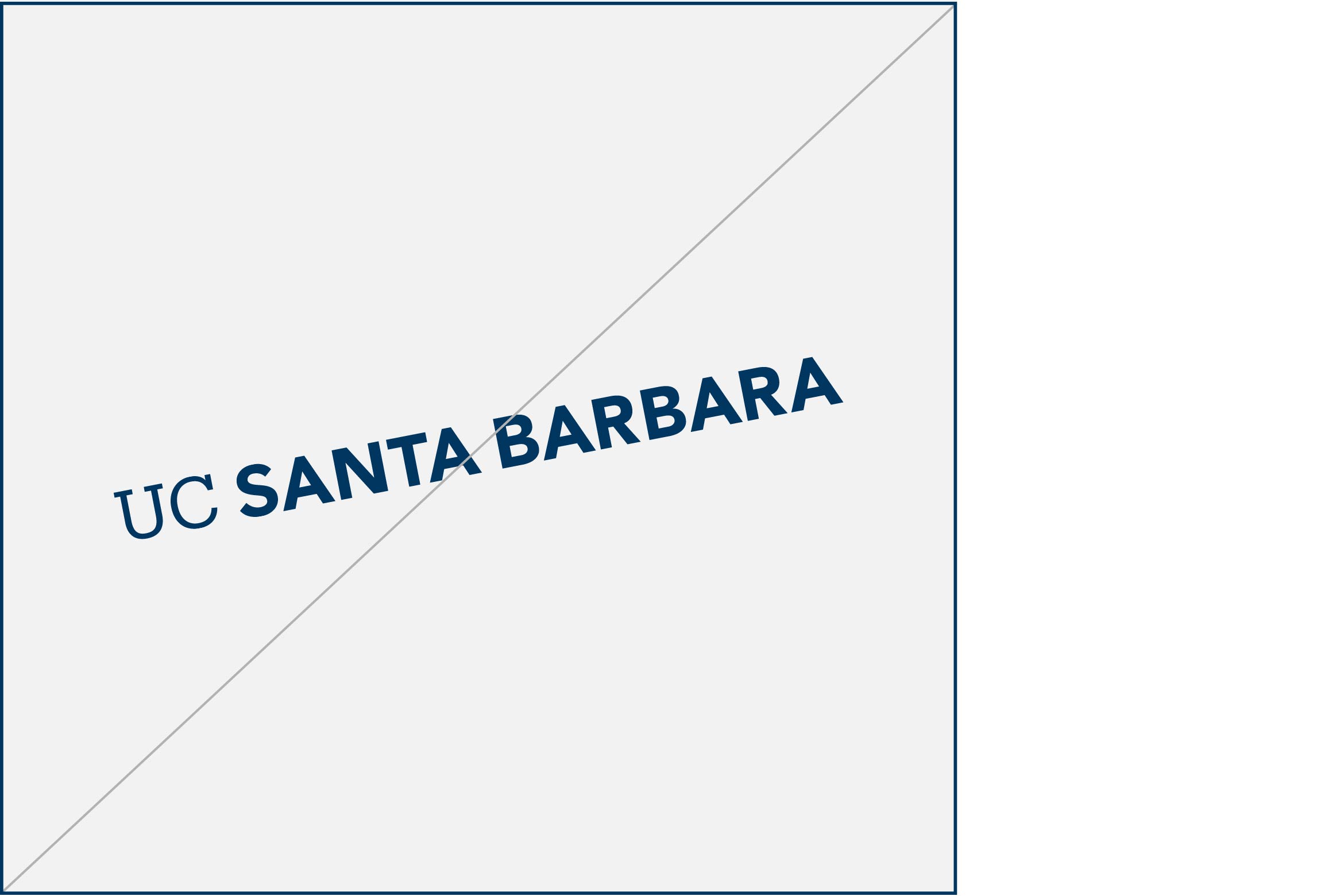
Do not rotate wordmark
Do not deconstruct wordmark
Do not stretch wordmark
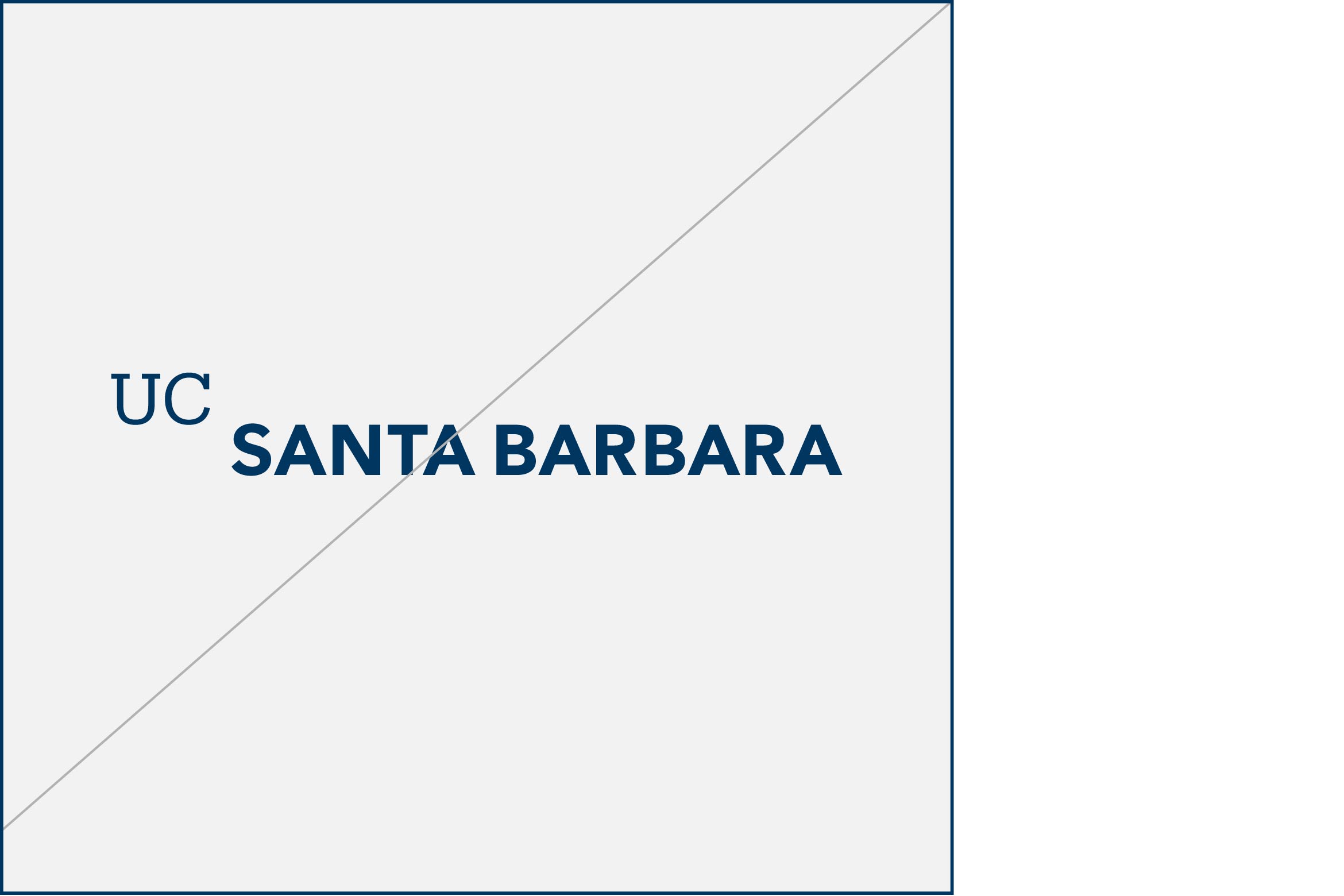
Do not change size relationship
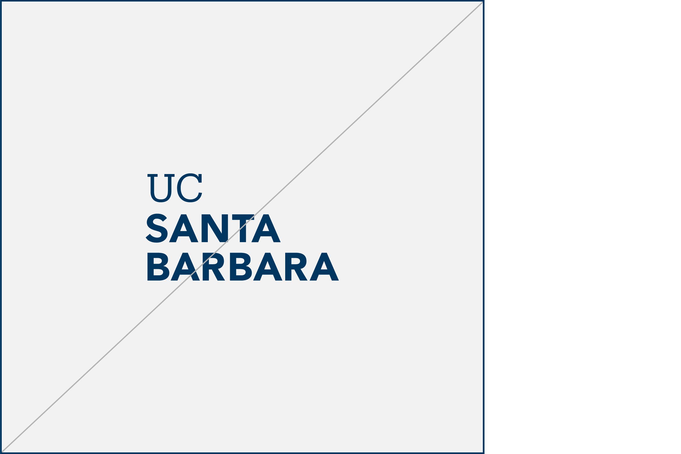
Do not stack wordmark
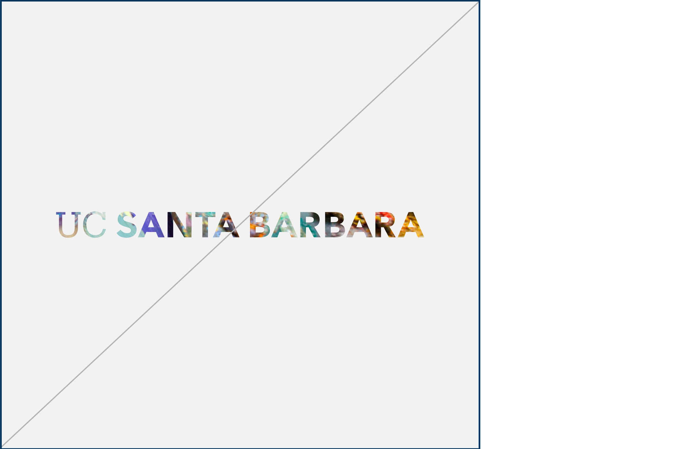
Do not fill wordmark with an image
Do not apply gradients to wordmark
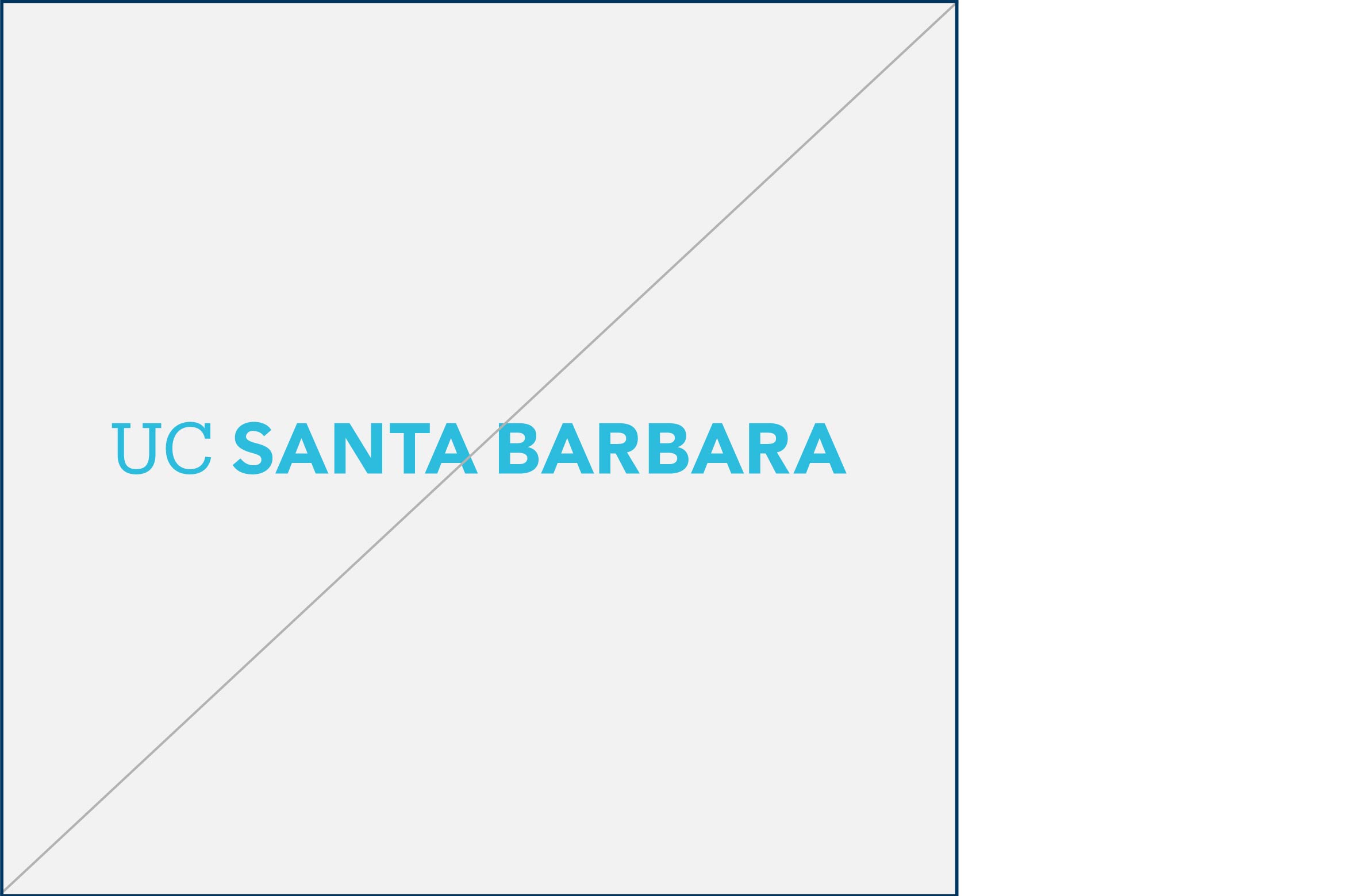
Do not apply new colors to wordmark
Do not outline wordmark
Do not use wordmark when typesetting
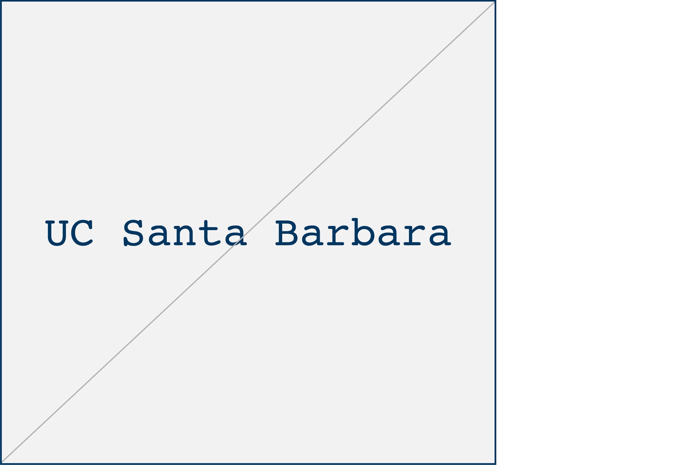
Do not recreate wordmark with type
Keep 'em handy
Download the PDF
The guidelines featured on this website represent a subset of the official UC Santa Barbara Identity Guidelines. Download the full set of guidelines for access to additional resources, best practice application examples, and more.