The campus wordmark lock-ups were created to support communications by academic entities, such as schools and departments. The design of the wordmark lock-up creates a strong UC Santa Barbara impression, helping to reinforce each entity’s affiliation with the university. The wordmark lock-up system promotes prominence for each entity by increasing the proportional size relative to the logos. Many lock-ups have already been created and can be downloaded from BOX. If you don't see your area's lock-up in one of the BOX folders, you can request one using the form below.
Color Versions, Backgrounds
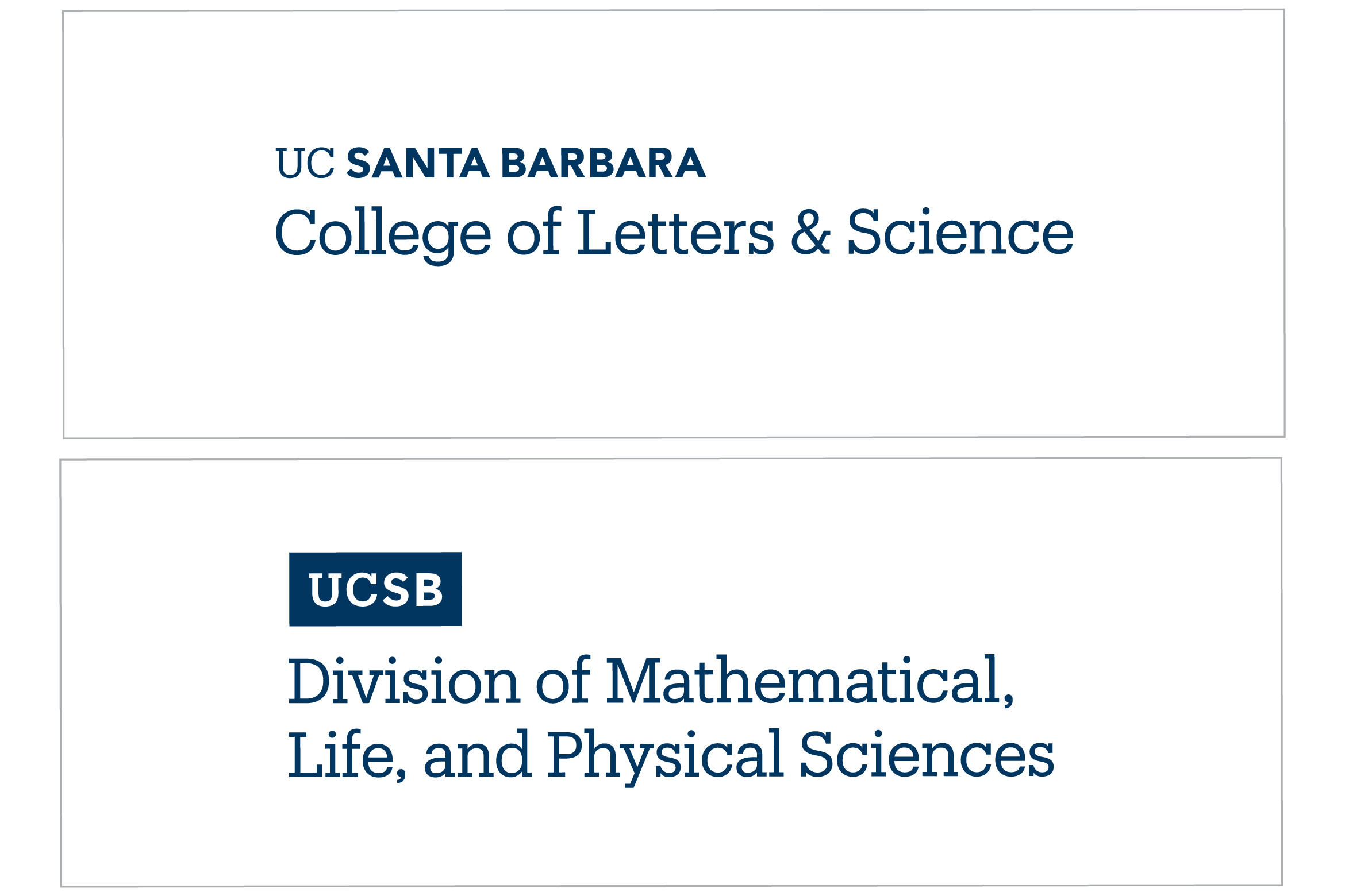
Navy is the preferred color for the campus wordmark lock-ups. When using the navy versions, white is the preferred background color. As a general rule, avoid placing the navy logos on colored backgrounds. Where applicable, the navy logos may be placed on our core gold color.
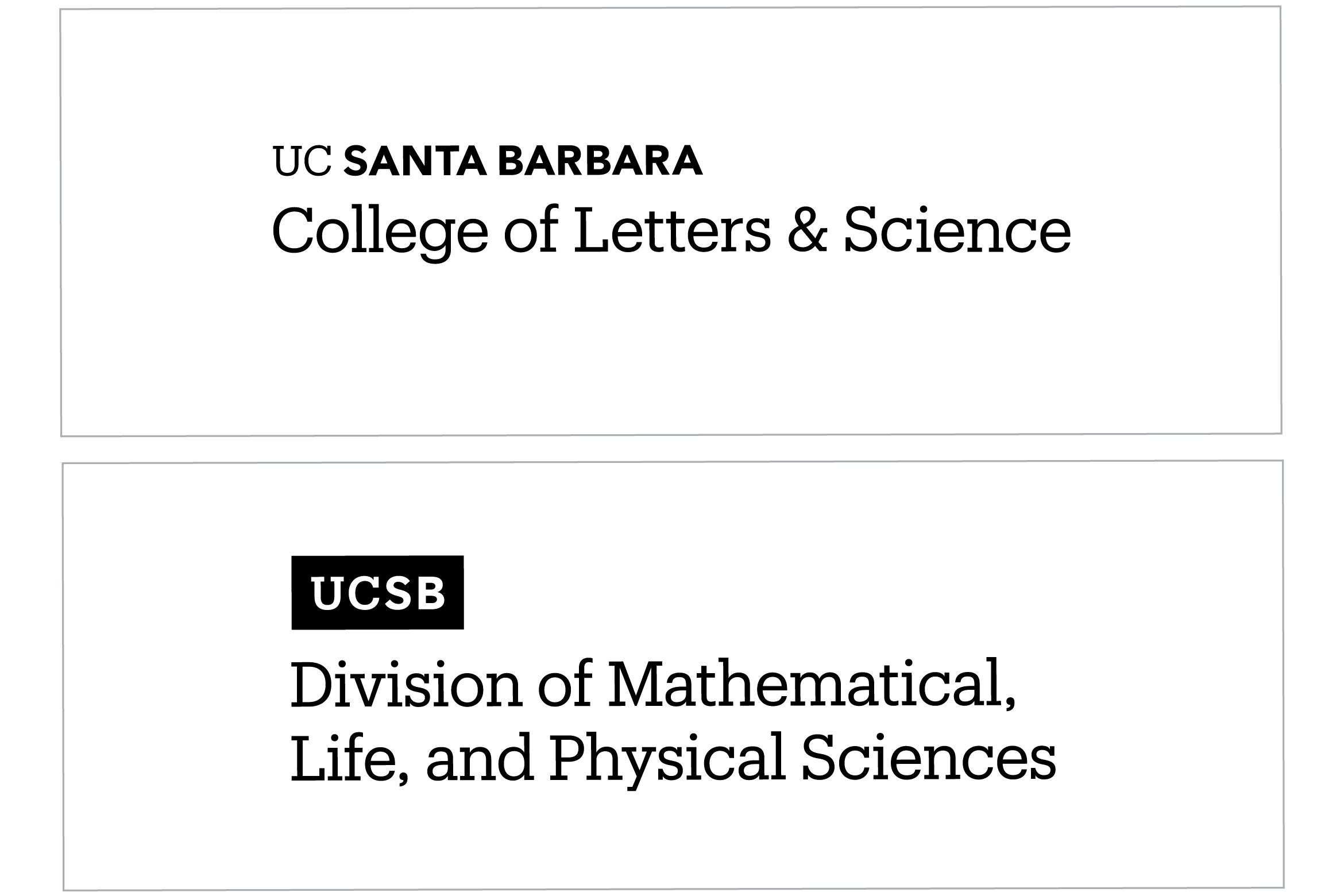
The black version of the campus wordmark lock-ups is available when black and white or grayscale designs are needed. When using the black versions, white is the preferred background color. Avoid placing this version on colored backgrounds to ensure adequate contrast and legibility.
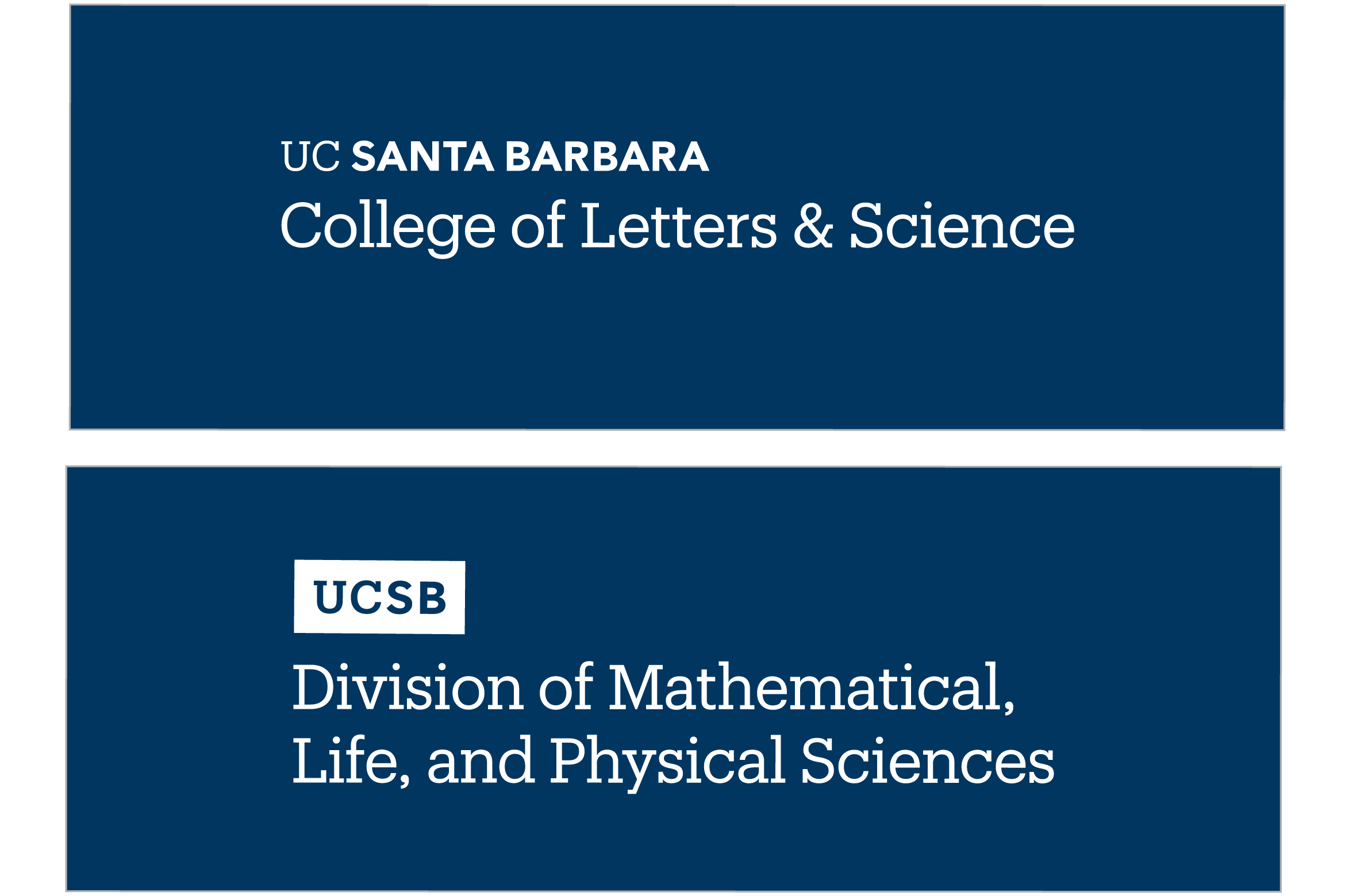
Use the reversed (white) version when placing the lock-up over navy, dark, or image backgrounds. Be sure there is adequate contrast between the lock-up and background to ensure legibility.
Flexible Hierarchy
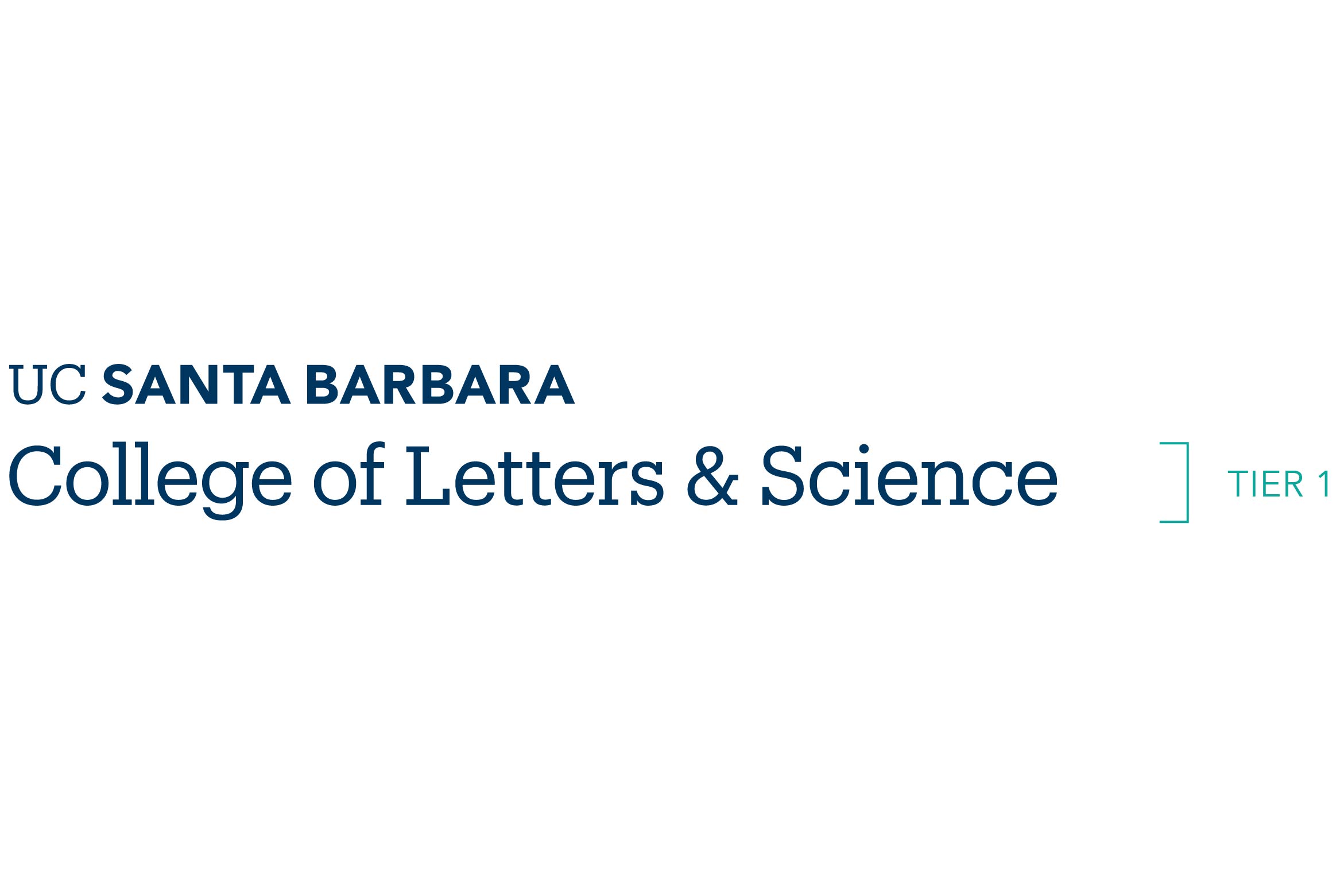
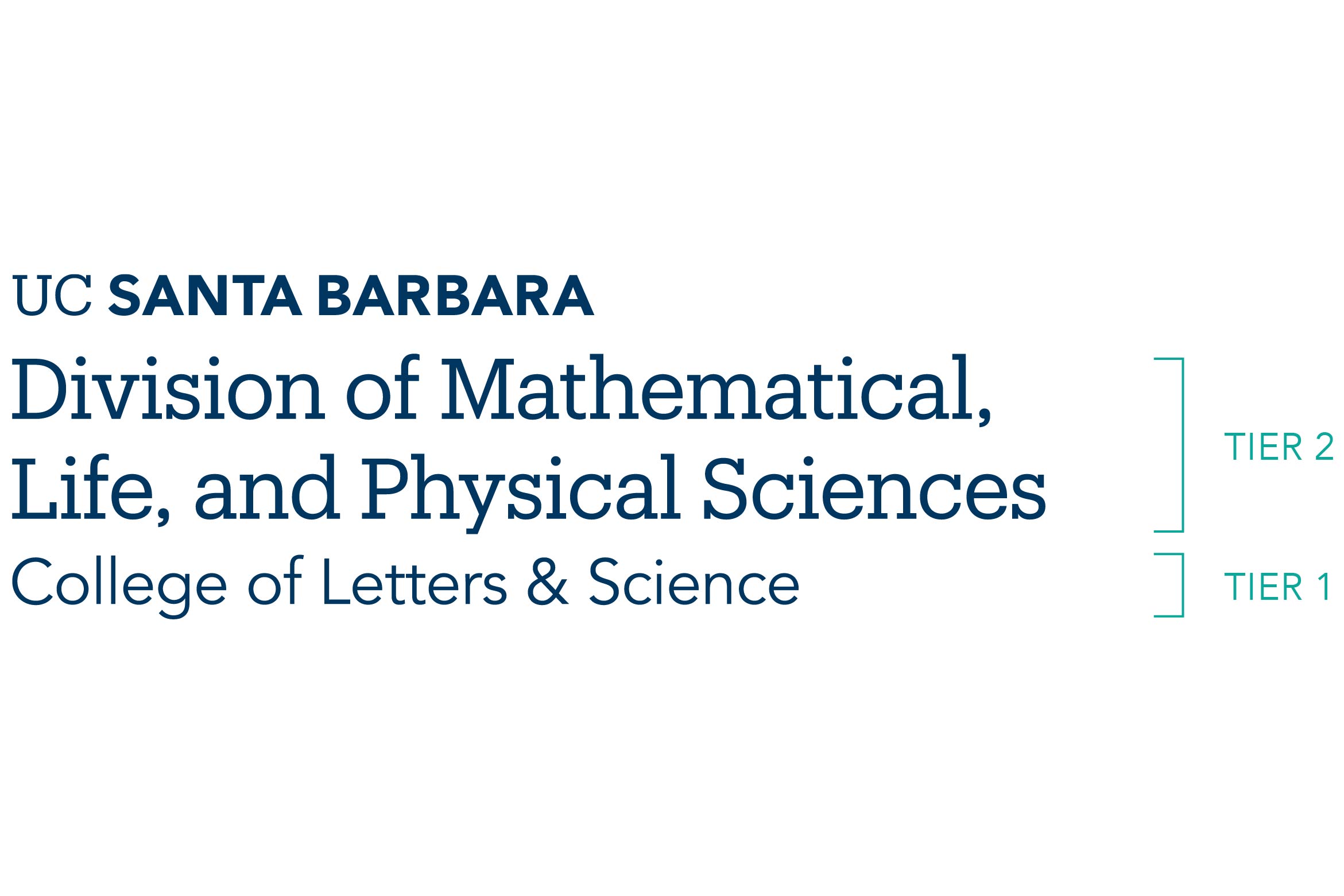
At UC Santa Barbara, we communicate with many audiences. Our wordmark lock-up system enables you to connect with a particular audience through a flexible hierarchy. This tiered hierarchy configuration retains a consistent relationship with the primary wordmark or secondary tab, while permitting variable prominence for college, divisions, or departments.
Primary lock-up
Minimum, Maximum Tier Lines
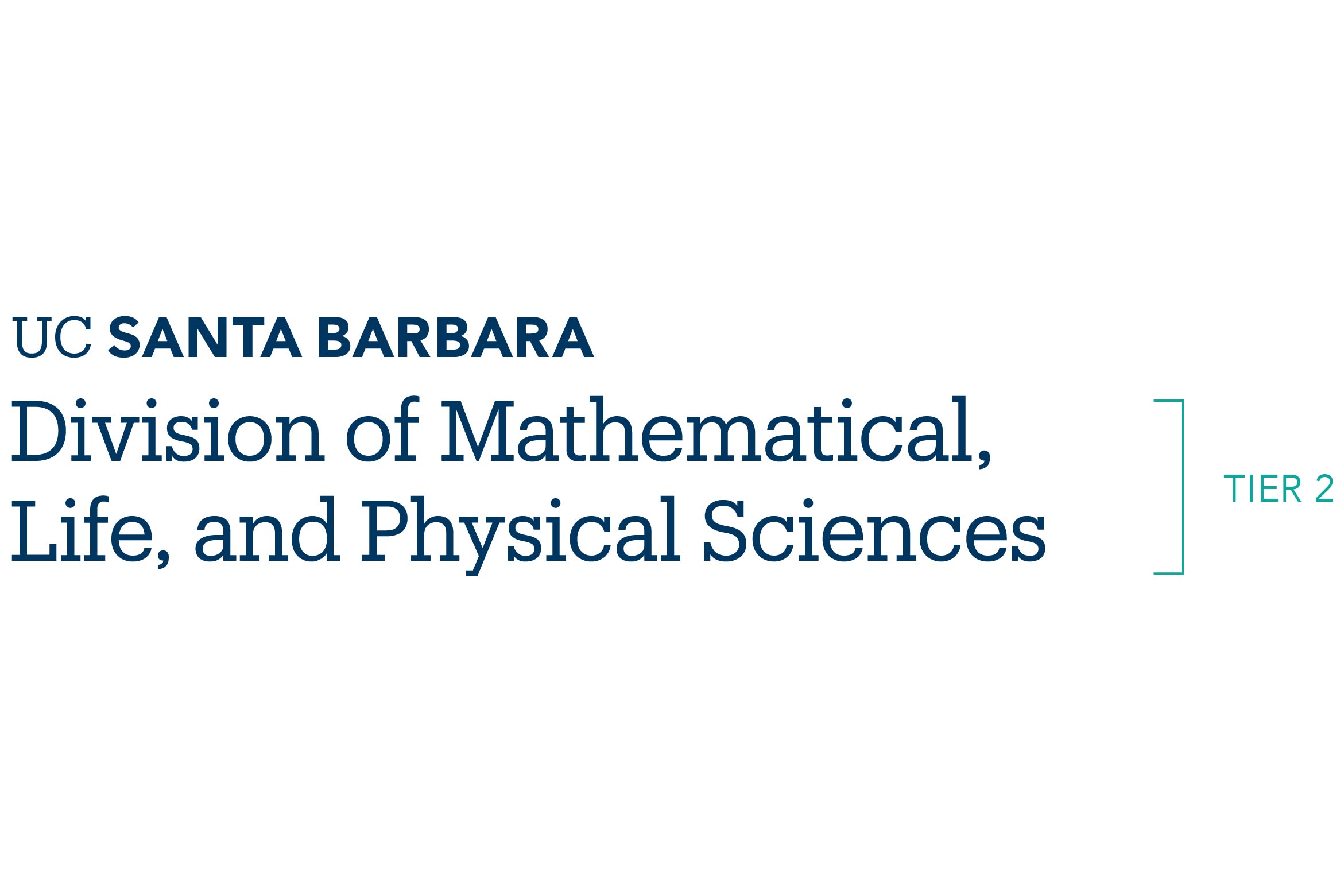
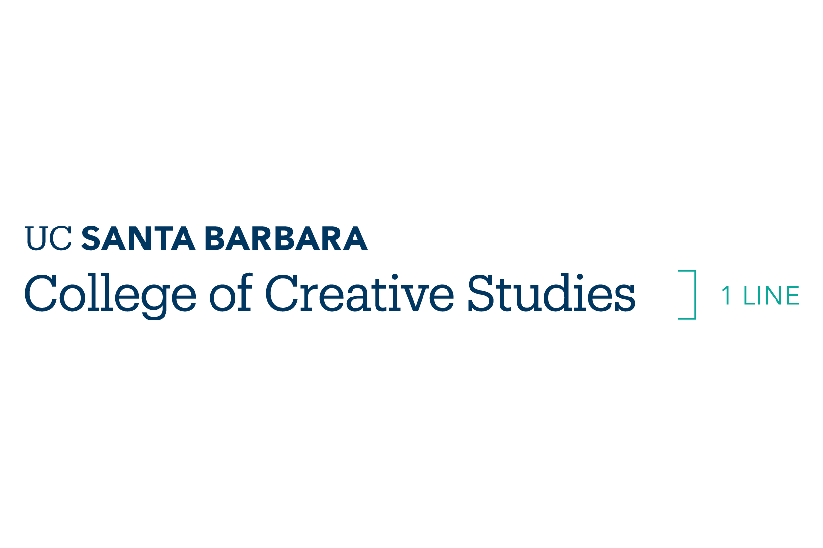
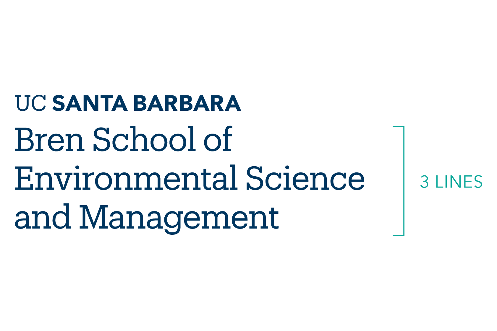
With all wordmark lock-ups, we aim to achieve the proper visual balance and legibility. Below are the rules addressing the minimum and maximum number of lines for both one tier and two-tier lock-ups.
One Tier - Minimum Lines
One Tier - Maximum Lines
Two Tiers - Minimum Lines
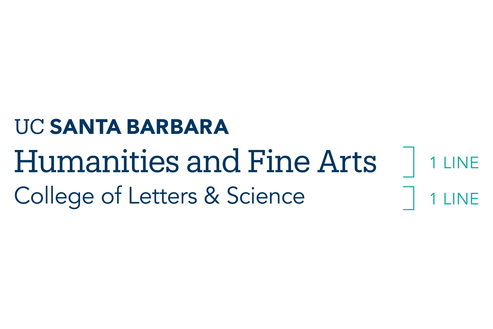
Two Tier - Maximum Lines
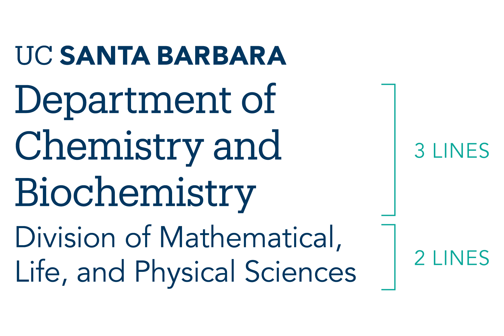
Clear Space, Minimum Size
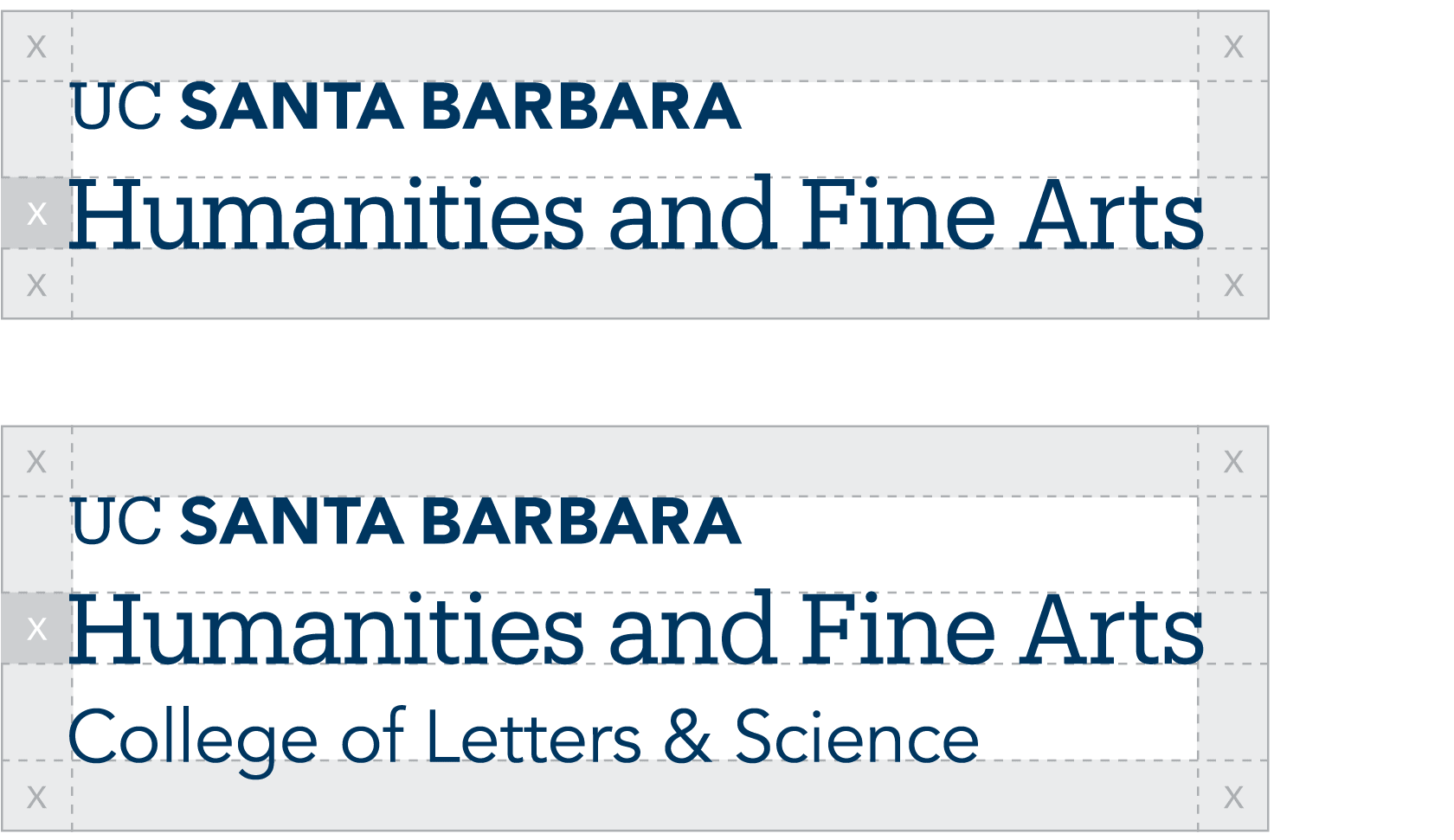
X = Height of "H"
Clear Space
To create and maintain maximum impact, the UC Santa Barbara wordmark lock-ups must never be too closely linked to or crowded by copy, photography, or other graphic elements. Providing the right amount of clear space around the wordmark lock-up makes it easier to distinguish, and reinforces the importance of the UC Santa Barbara and sub-entity’s identity. The required amount of clear space to ensure maximum visibility and legibility is determined by the x-height denoted in this example. The same clear space requirement applies to a multi-tiered wordmark lock-up.

Minimum print size: 1.25" wide (31.75 MM)
Minimum screen size: 120 pixels wide
Minimum Size
The campus wordmark lock-ups are optimized for all applications. It is designed to scale and function at small sizes for print and digital applications and large sizes for outdoor environments. To ensure legibility and reproduction, adhere to these minimum sizing requirements.
Incorrect Usage
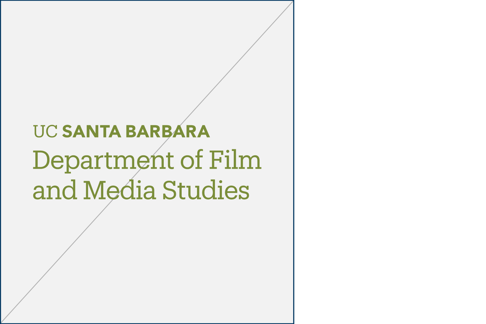
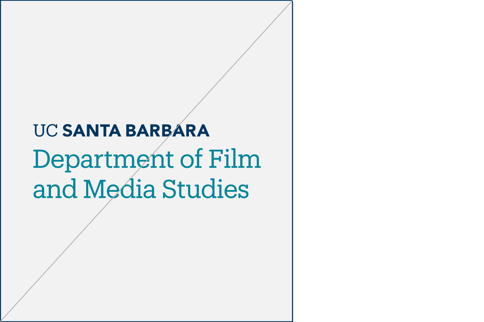
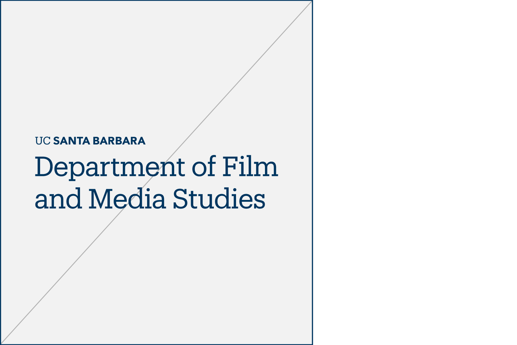
The impact of our wordmark is dependent on proper, consistent use. Any changes to the shape and color of the campus wordmark lock-ups will change or diminish the important values, ideas, and meanings with which they are associated. Our wordmark is, among other things, a symbol of reputation — alter it, and it can subtly shift perceptions of the institution. For this reason, strict adherence to the correct usage and implementation is critical. Below are some examples of incorrect usage.
Do not alter spacing
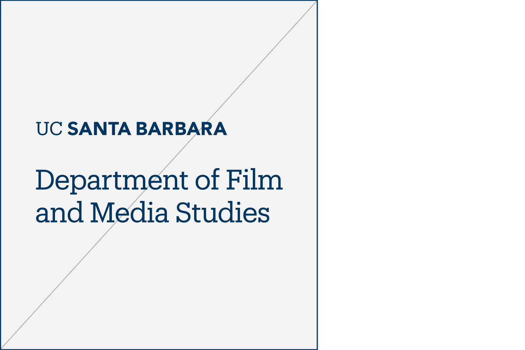
Do not stack elements
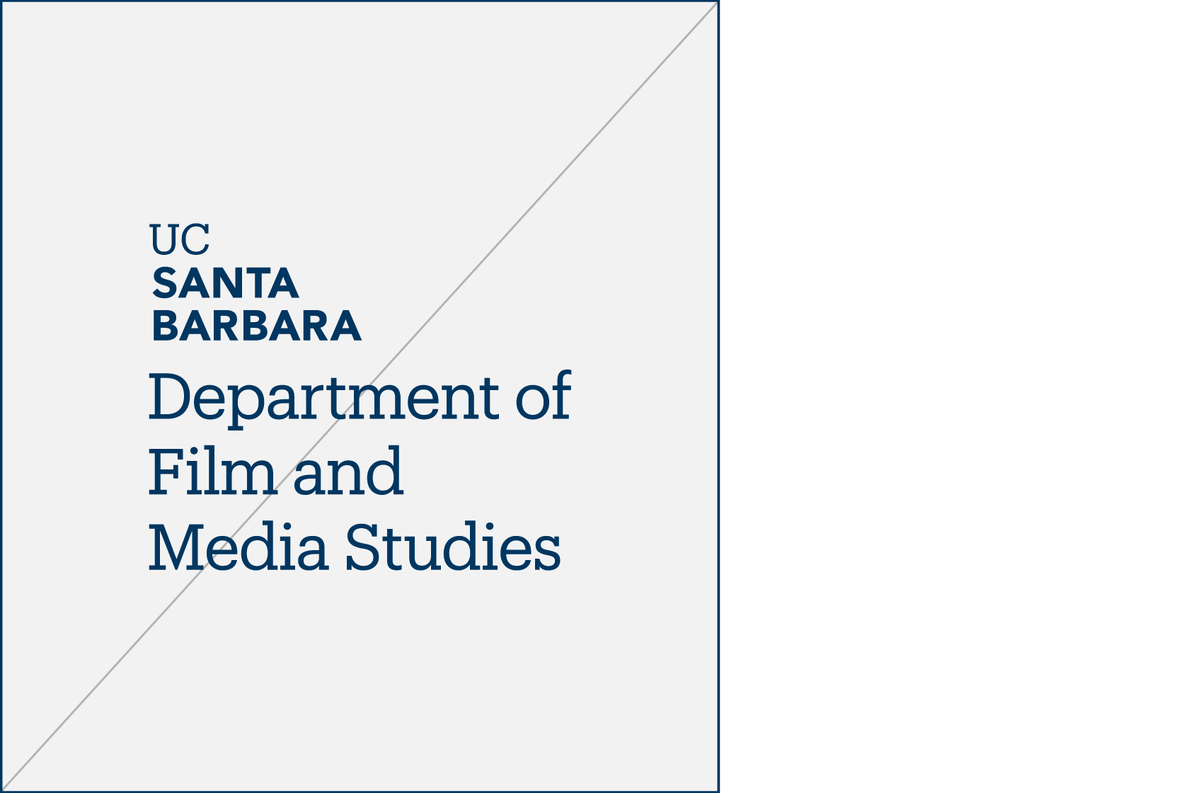
Do not alter color
Do not alter color of tiers
Do not alter spacing (leading)
Do not change size relationship

Do not change type weight
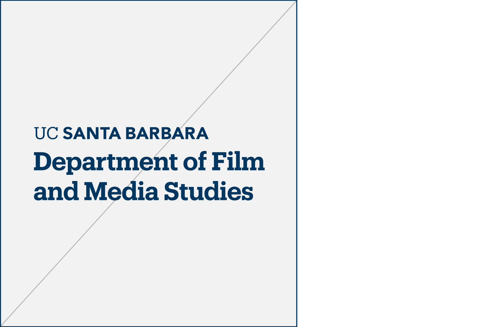
Do not change type weight of tiers
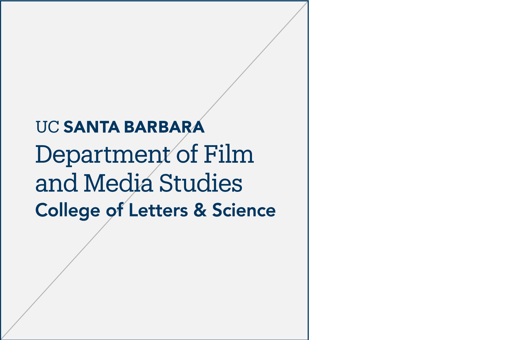
Do not add lines beyond maximum clearance

Keep 'em handy
Download the PDF
The guidelines featured on this website represent a subset of the official UC Santa Barbara Identity Guidelines. Download the full set of guidelines for access to additional resources, best practice application examples, and more.