The secondary tab logo can be used on applications intended for local or internal audiences where there is a known association between UCSB and UC Santa Barbara. Each element of the tab has been specifically placed, sized, and rendered. The tab should never be modified or redrawn in any way.
Color Versions
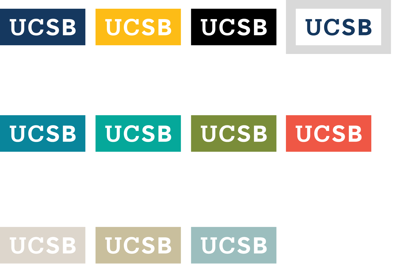
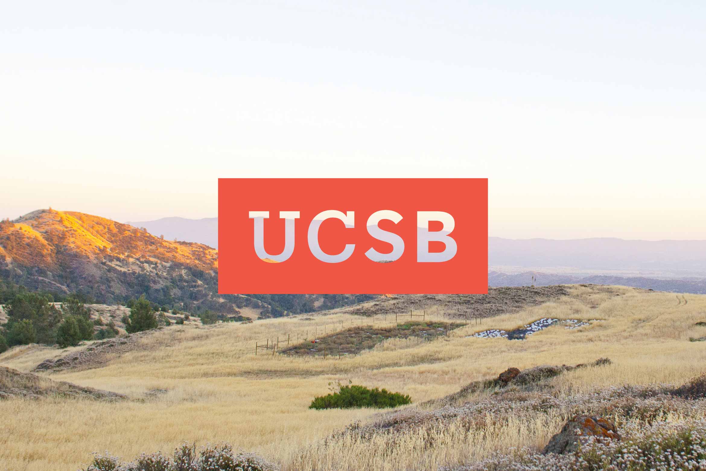
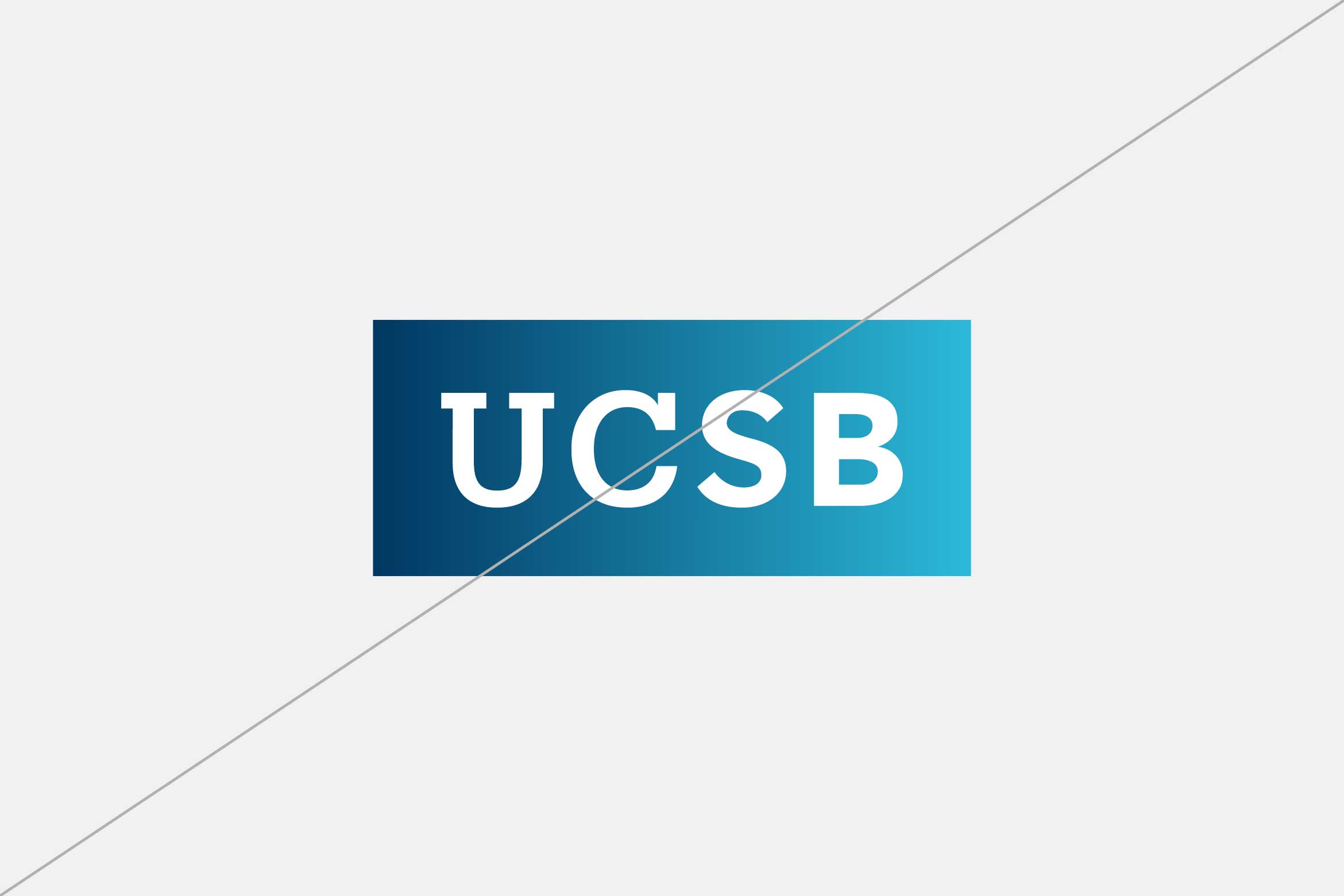
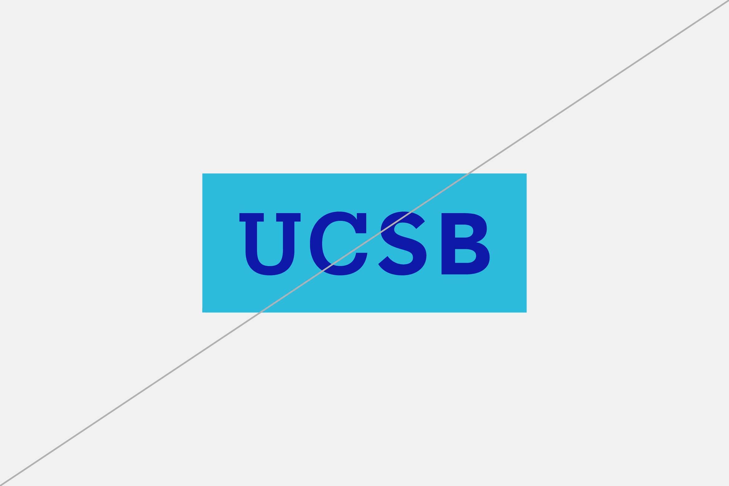
The secondary tab is available in select colors from our color palette. The use of the tab in color broadens our expression and adds vibrancy to our identity. Use the tab in the primary colors, navy or gold, to reinforce our University of California pride, or introduce our location-inspired secondary colors to add vibrancy.
Color Versions, Backgrounds
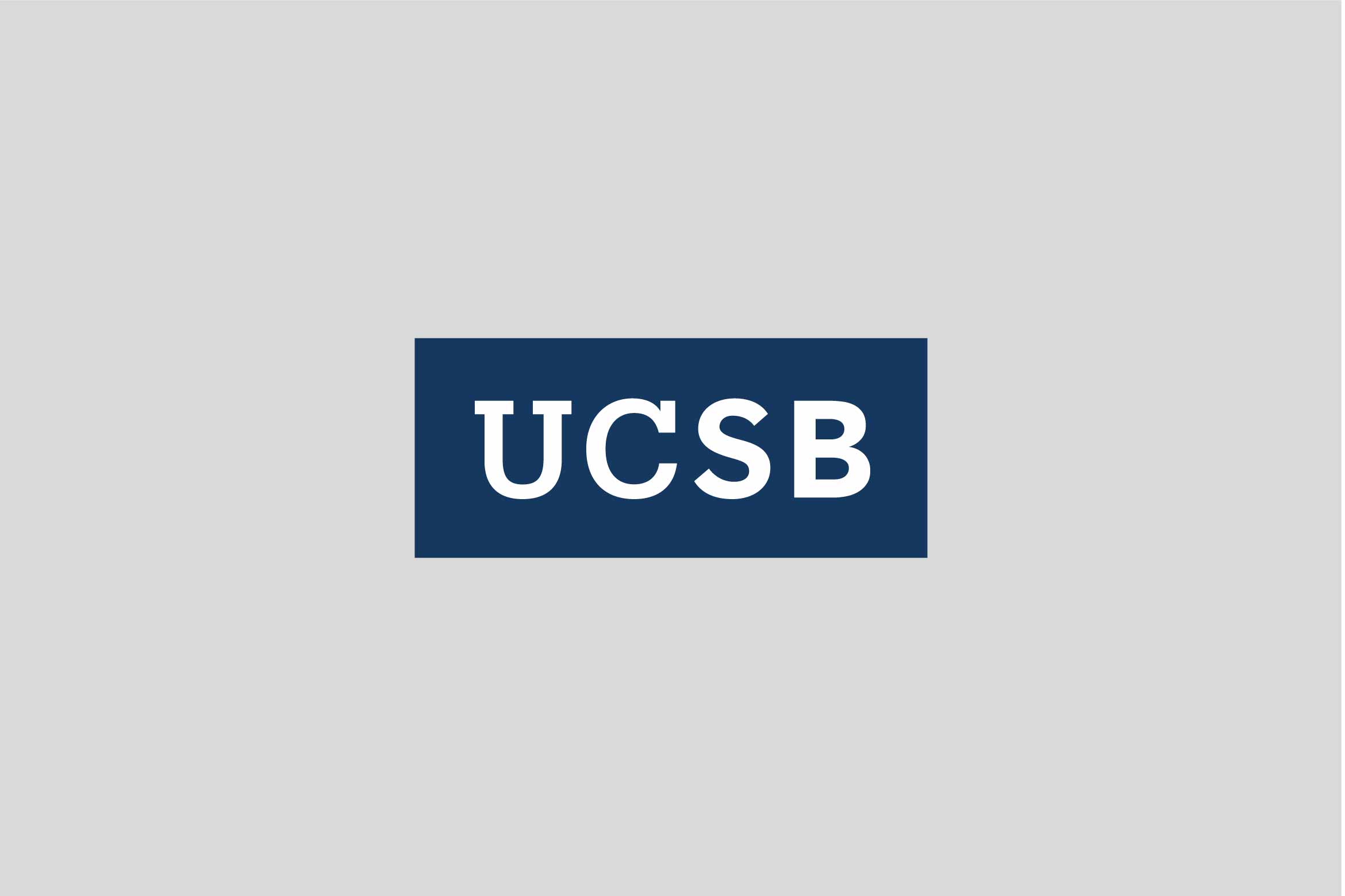
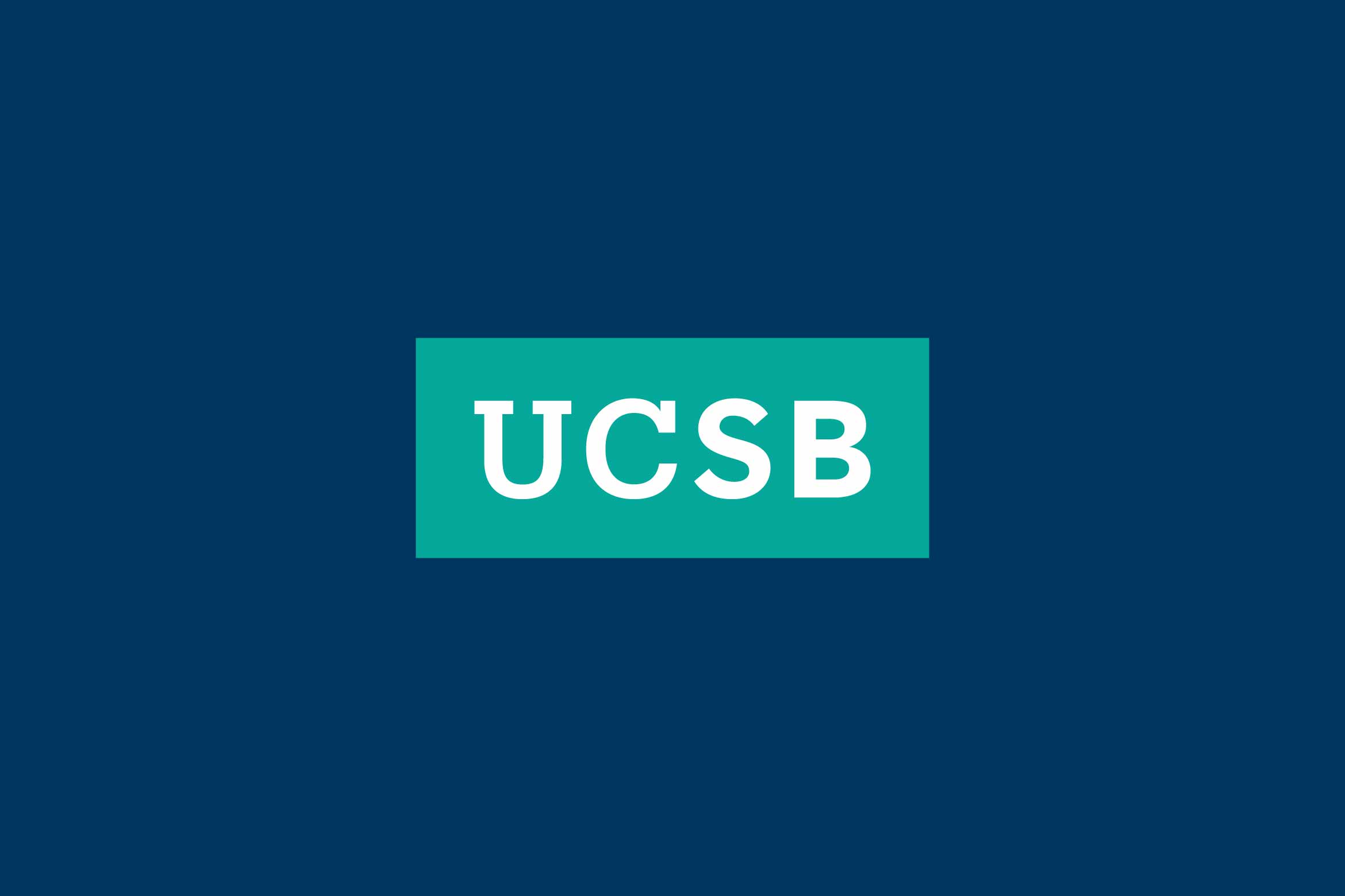
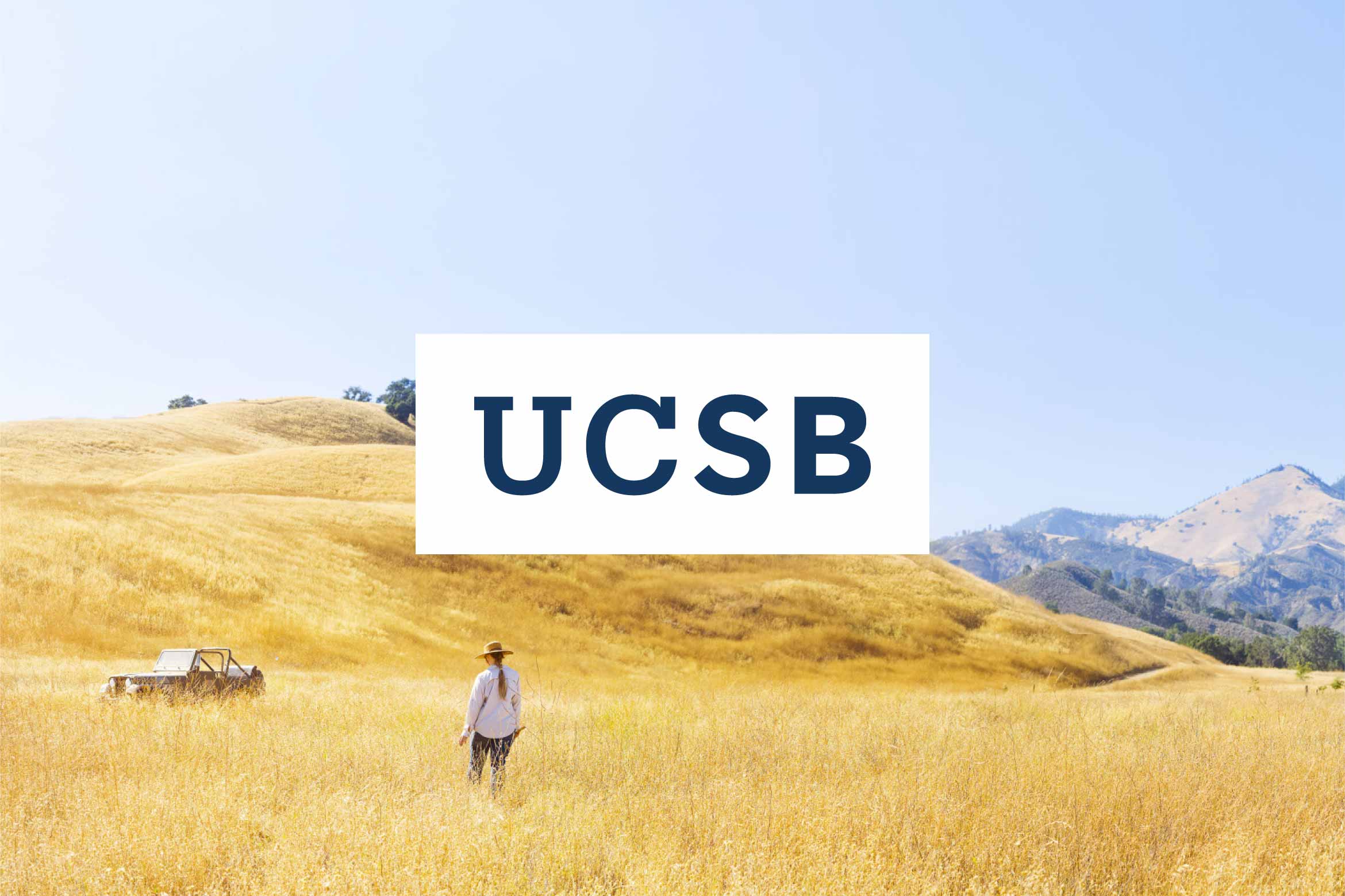
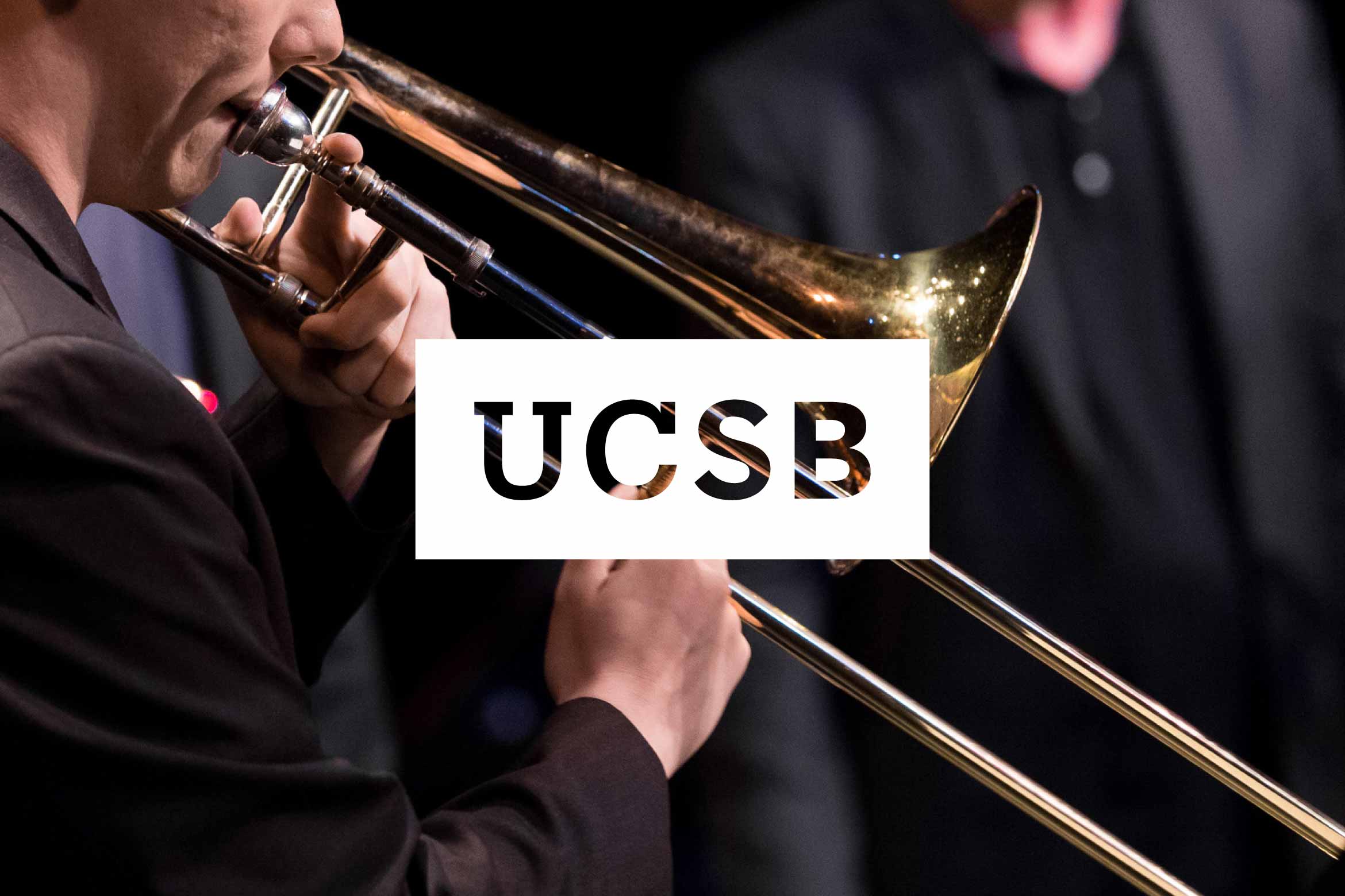
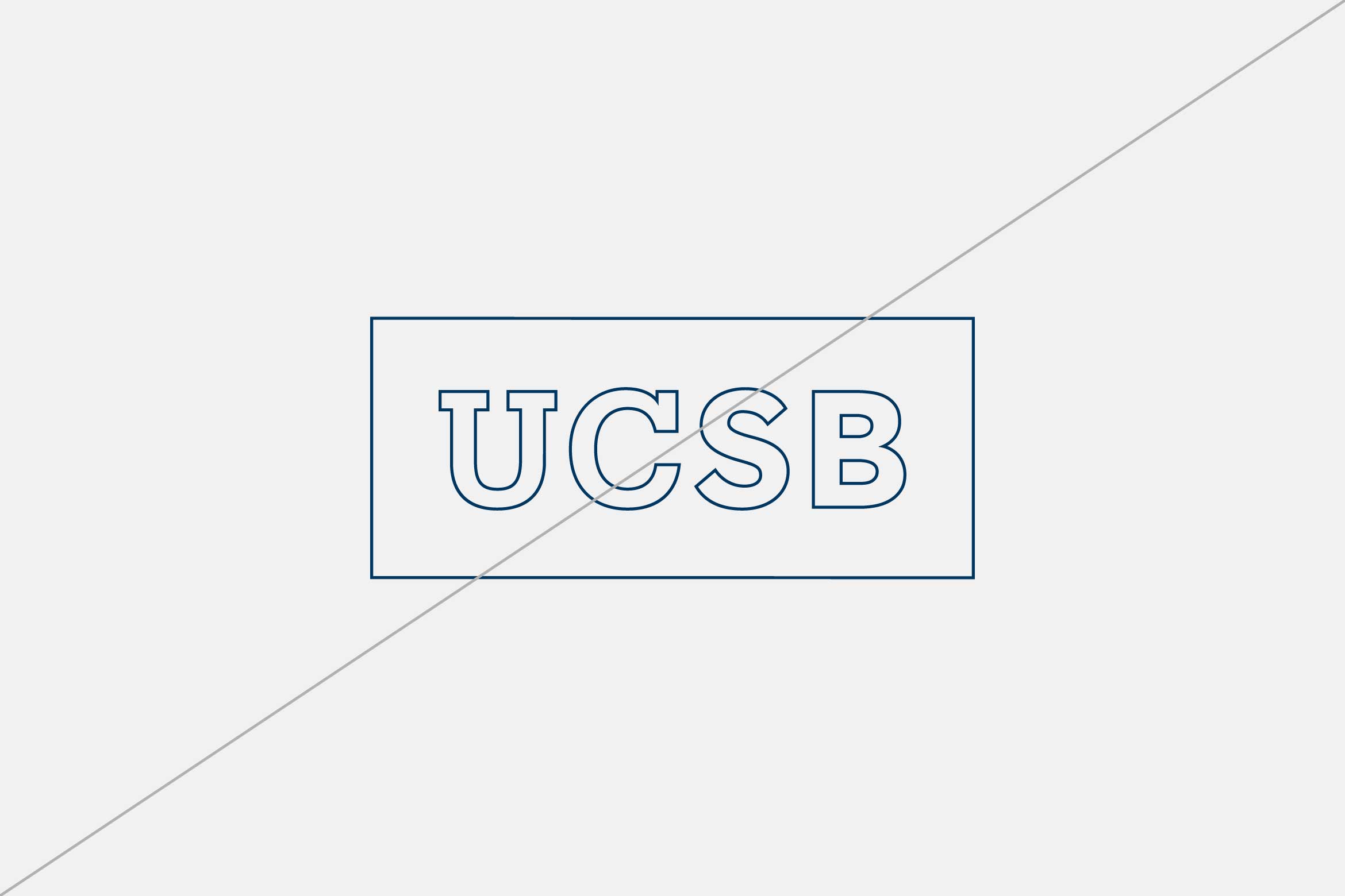
The secondary tab is available in all colors shown below with UCSB set in white or transparent which allows the photography to come through in the tab. It is also available in reverse (white) versions with UCSB in navy or transparent. Be sure there is adequate contrast between the tab and the background to ensure legibility.
Solid Type
Transparent Type

Clear Space, Minimum Size, Relative Size and Placement
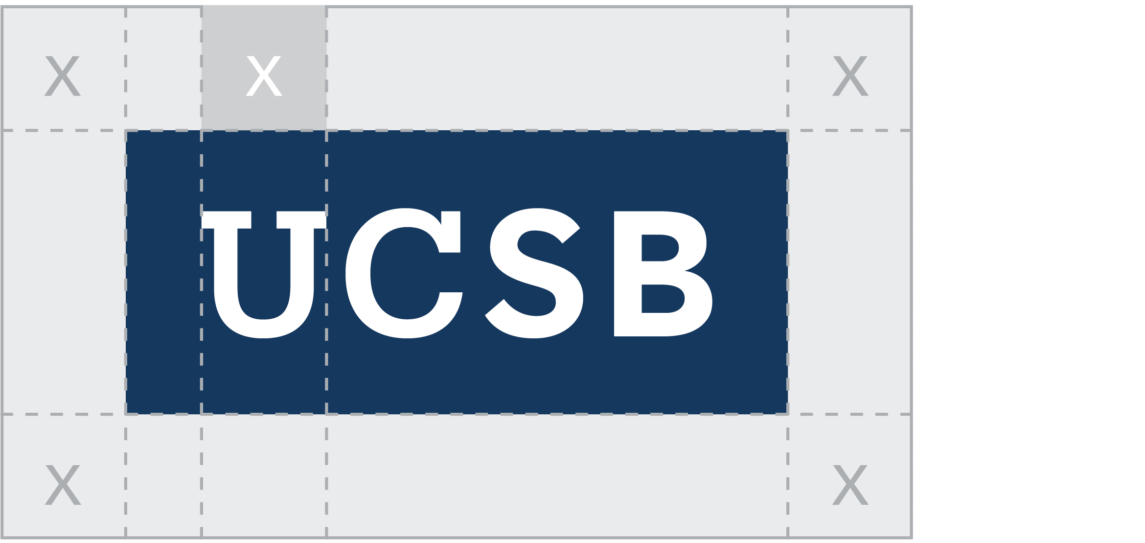
X= Width of "U"
Clear Space
Providing the right amount of clear space around the secondary tab makes it easier to distinguish visually and reinforces the importance of the UCSB acronym. Similar to the primary wordmark, the required amount of clear space to ensure maximum visibility and legibility is determined by the width of the “U” in UCSB.
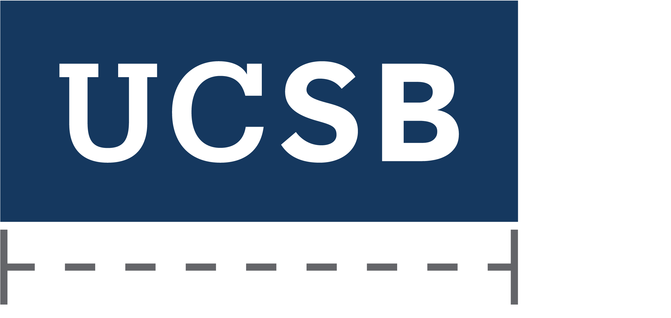
Minimum print size: 0.5" wide (12.5mm)
Minimum screen size: 36px wide
Minimum Size
The secondary tab is optimized for all applications. It is designed to scale and function at small sizes for print and digital applications and large sizes for outdoor environments. To ensure legibility and reproduction, adhere to the minimum sizing requirements outlined below.
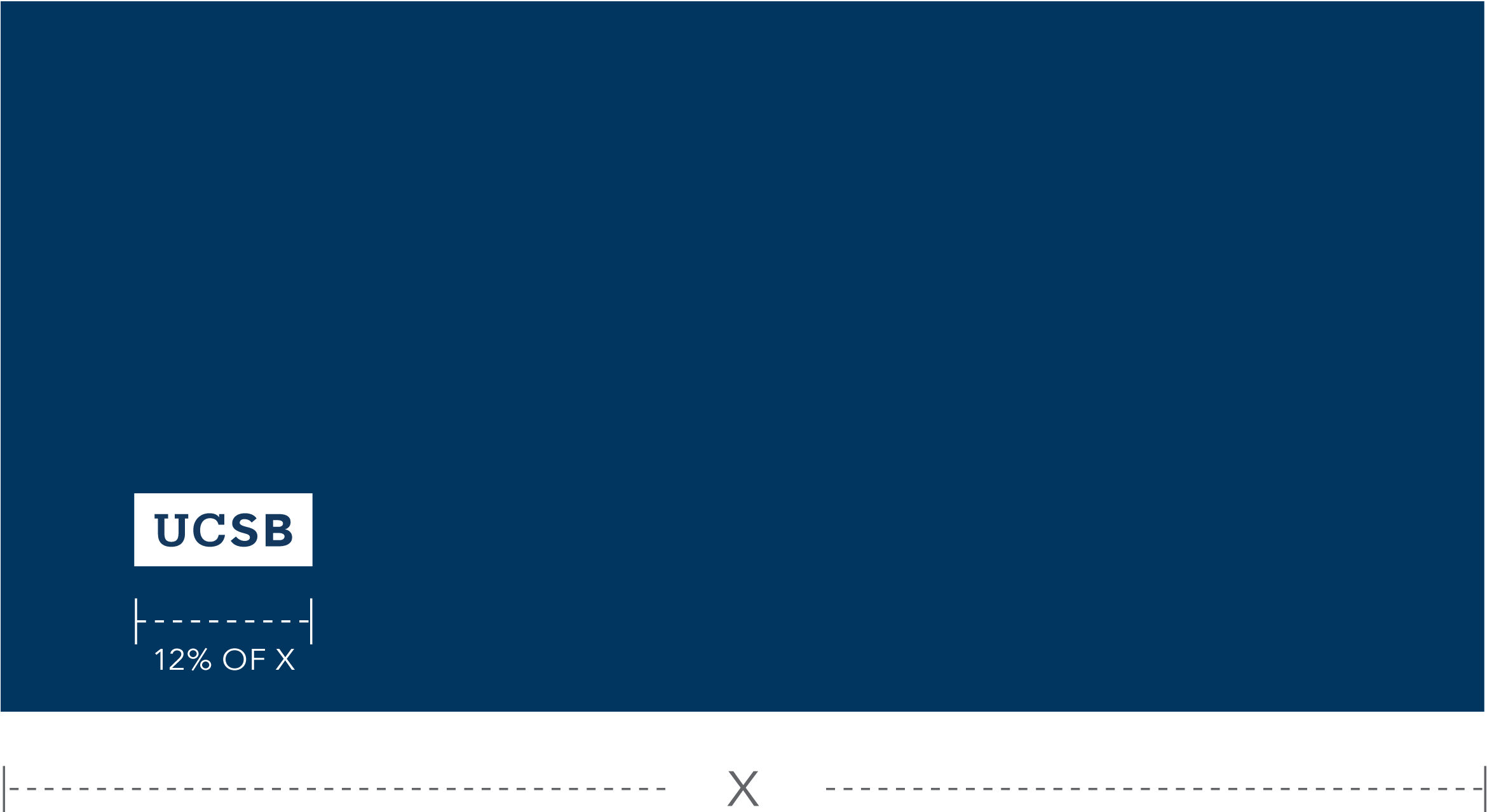
Relative size is 12% of X where X is equal to the application width
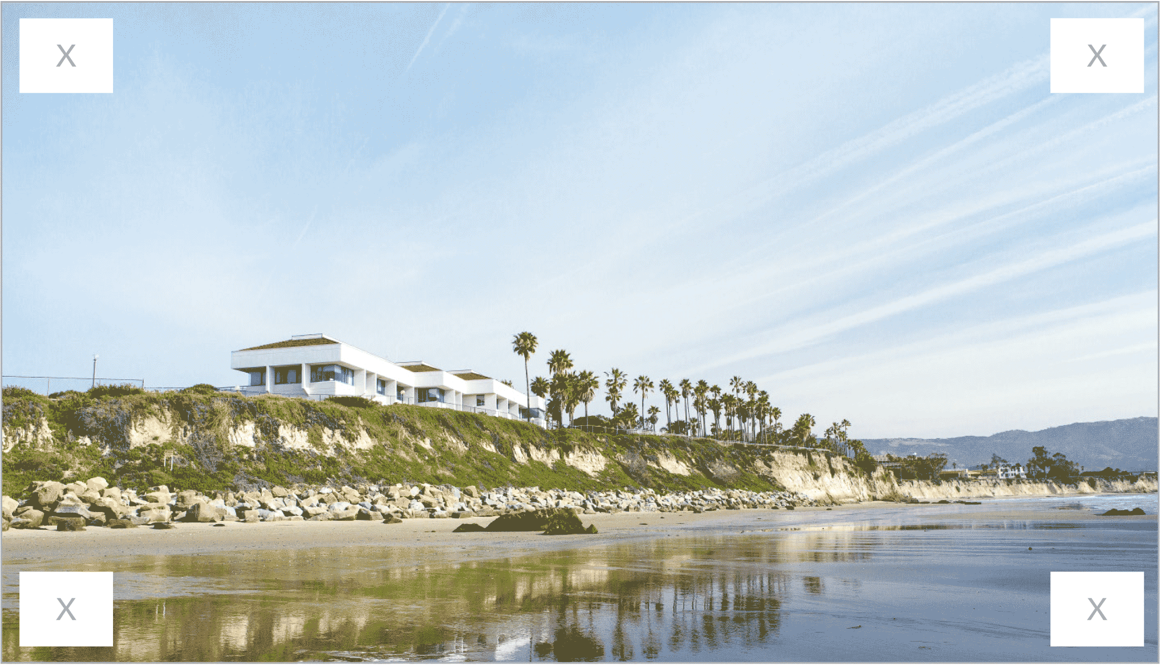
Relative Size and Placement
The size and location of the secondary tab in layouts is important for recognition, especially when seen multiple times across various touchpoints. A consistent approach to the tab placement helps create stronger recognition over time. The exhibits below show relative sizing standards and preferred placement.
Incorrect Usage
The impact of our logo is dependent on proper, consistent use. Any changes to the shape and color of the secondary tab logo will change or diminish the important values, ideas, and meanings with which it is associated. Logos are, among other things, symbols of reputation — alter them, and they can subtly shift perceptions of the institutions they stand for. For this reason, strict adherence to the correct usage and implementation is critical. Below are some examples of incorrect usage.
Do not remove letterforms from tab
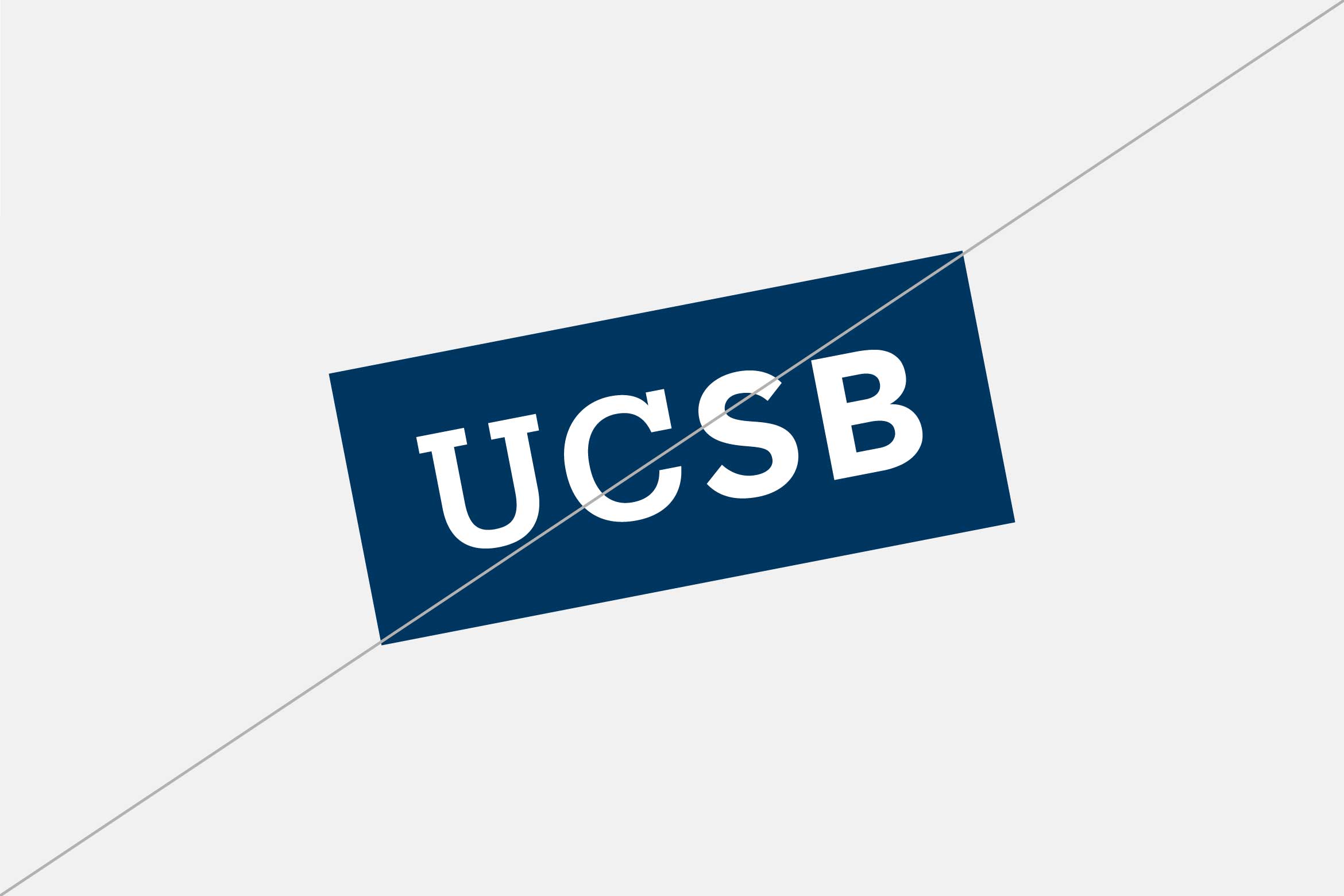
Do not rotate tab
Do not deconstruct tab
Do not stretch tab
Do not alter rectangle
Do not stack letterforms
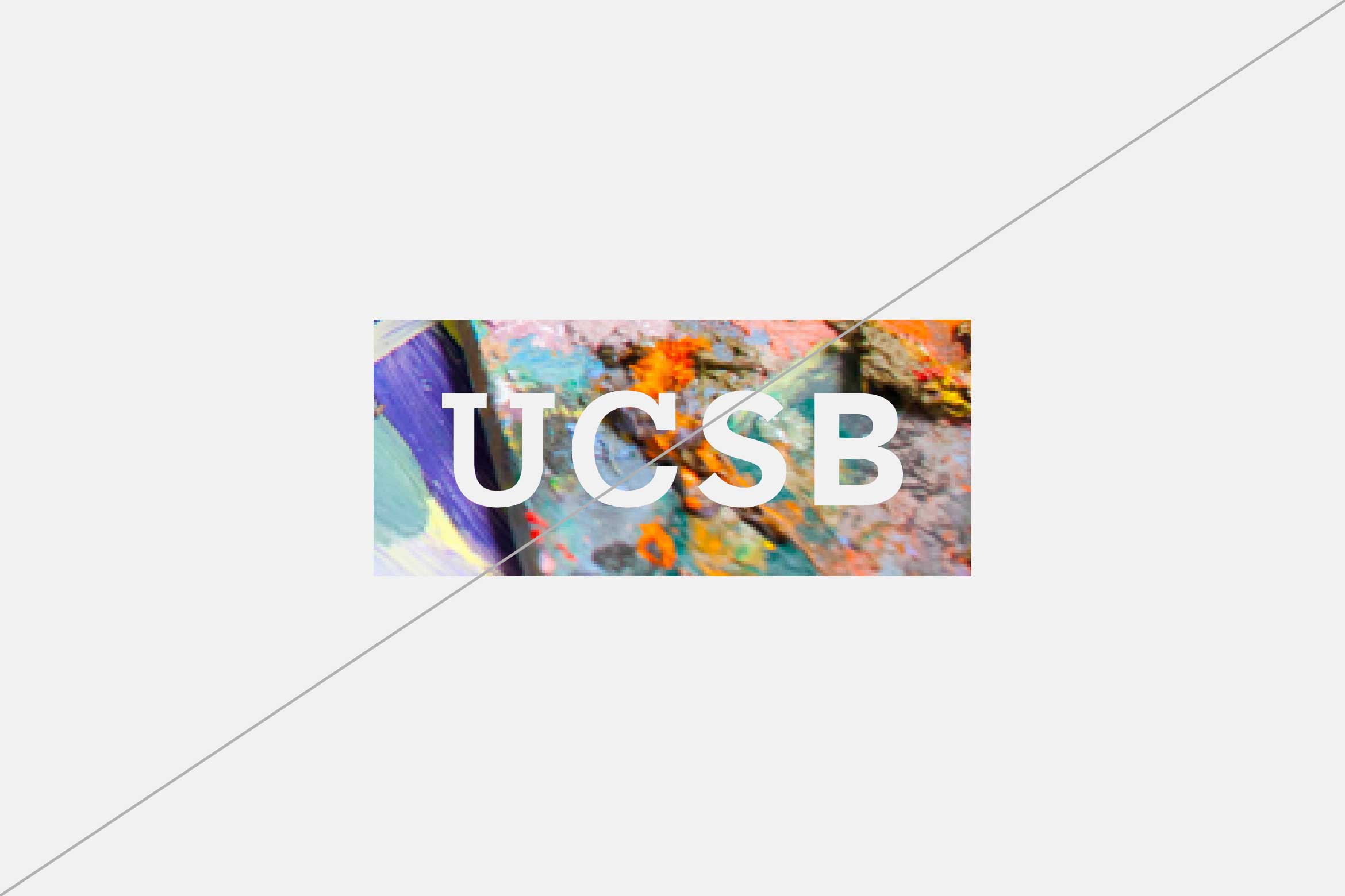
Do not fill tab with an image
Do not apply gradients to tab
Do not apply new colors to tab
Do not outline tab
Keep 'em handy
Download the PDF
The guidelines featured on this website represent a subset of the official UC Santa Barbara Identity Guidelines. Download the full set of guidelines for access to additional resources, best practice application examples, and more.